Images in emails
Дизайн

Лена Шумная
Subscribers share emails with cool pictures and interesting animations to friends, and email marketing colleagues send them to work chats. Today we will inspire you with images!
The fate of photos in the mailing list is determined by the designer and marketer. It all depends on the purpose of the email and the creative intent. And now we are not talking about email design in general, but about photographs that complement and reveal the overall concept. Stylish shots of the new collection in emails of clothing brands, macro shots of beauty products, sunny beaches in airline emails, and so on.
How to focus attention, where and what size should the photos be, what meaning do they carry? Let’s figure it out!
Where to put a photo in an email
Main banner
What is important to always remember: we need to catch the subscriber’s eye "from the doorway", that is, from the first screen. The main banner is what the subscriber sees immediately after opening the email. He may not have time to read the title, buttons and other text yet, but the brain will have time to read the picture and decide whether it’s wow or not.
Therefore, the first image in the email should be the key.
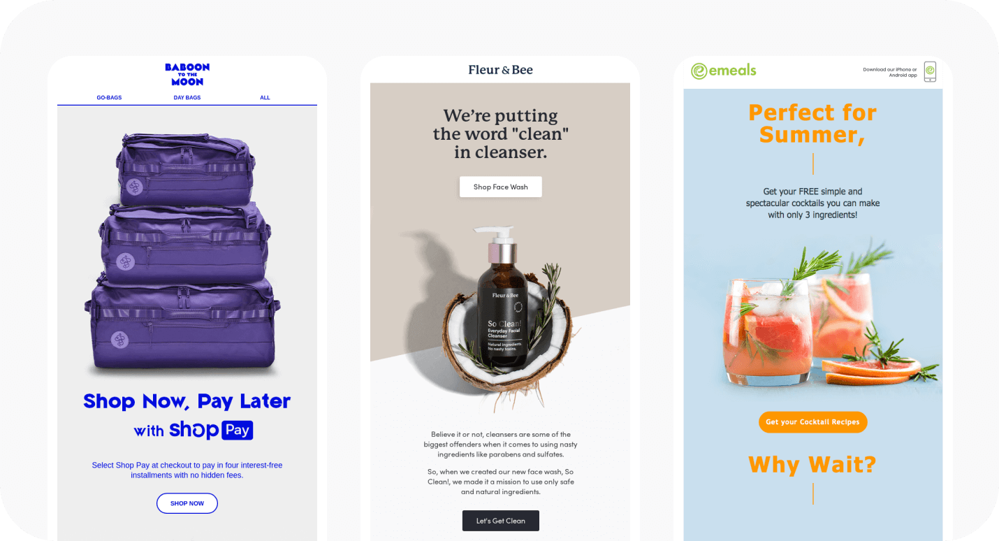
Personal experience: We’ve done several A/B tests and found that users interact better with an email if the banner is placed at the beginning of the email. These emails had 2x more conversions than those with an image in the middle of the email.
Look at the banners that Jo Malone London uses in emails. They may have a bright plot photo, or there may be an example of an advertised product. But no matter what, the structure of emails is always the same: a large photo that immediately grabs attention, and the text under it.

Or take a look at this email from Rains. Raincoats can be bright and overshadow the rainy dullness—this thought is read from the mailing immediately, even before reading the text. Just look at the orange photo.

Product mix
Online retailers often place a "family photo" on the main banner of all the products that will be discussed in the email. Images help to describe the product and convey its main features.

Banner to the content block
The content block is the part of the email where the photos will be just in place. They will tell a whole story and evoke pleasant associations, because of which the subscriber can make a purchase. At least, these are the images that tour operators and companies involved in repair and interior design are counting on.

To ensure that photos in all blocks are displayed exactly as you intended, put a link to the web version at the beginning or end of the email. Some users view emails without pictures by turning off this option in the settings, while for others, pictures can take a long time to load due to slow Internet access. This also needs to be considered.
How brands use images
Each company can choose a suitable image that can decorate an email. Most often, photos can be found in emails that sell us something. And show the products in the best way.

Images in emails reflect the mood of the time, the brand concept, and convey the core values of the project.

Some companies often use stock photos for their emails. This is ok, but there is a high probability that the user has "already seen this somewhere".

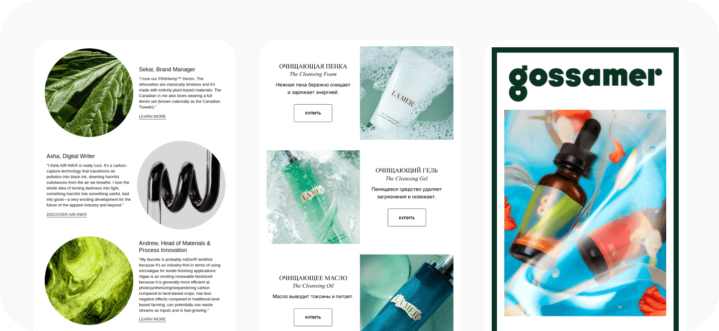
The purpose of using photos for each brand may be different. Tech companies use them to demonstrate their product in detail, in cases where it needs to be shown in detail.

Others demonstrate product use: a clothing brand can show how things look on the street, and a shoe brand can show how its sneakers are tested off-road.

Photos are used to show important features and characteristics of advertised products. For learning. For inspiration. For whatever goals your business wants to achieve—and for which you have the right photo.
How to do cool: email trends in 2022
Back to the childhood. Make infantile designs with funny icons, stars and unicorns, as if they were drawn by a schoolgirl in a boring biology class.
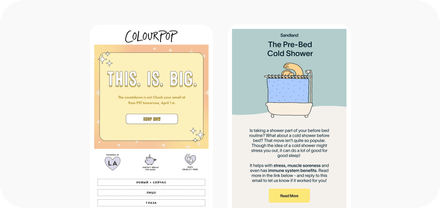
Gradient. Here you can not be shy and not even look for similar shades, but just bang 4−5 acid colors at once. We bet it will be awesome!

Dark side. The black theme is gaining momentum! Increasingly, you can find this color scheme among users. In general, this is understandable—the eyes are less strained, the battery charge is saved. Many brands have embraced this and are opting for dark backgrounds for their emails.

Under the microscope. The trend has been seen in beauty brands and cosmetic companies. The reader seems to be looking at the ingredients of the products under a magnifying glass or just seeing the jars in macro photography—this can be quite exciting.
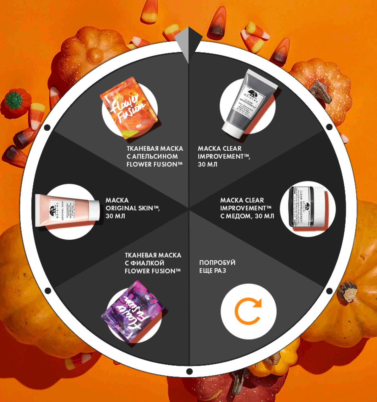
Animation and interactive elements. Sometimes we just open an email and then find ourselves stuck in it :) It’s cool to keep the subscriber’s attention with interesting graphic solutions and animation. Eye-catching!

Minimalism. Laconic emails without animation, a lot of text and sometimes even without color. The principle "the simpler the better" is always relevant.

9 tips for using photos in your emails
Invest in great product shots. Show your product at its best. The brand will need such shots, because the photos will be useful for use in promotional campaigns.
Show what’s important. For example, what benefits the product will bring, what it consists of or how it looks in real life.
Use photos with people. This helps to win over the reader and inspire confidence, because a person will be able to transfer the image from the email to himself. However, keep in mind that you can not use images of people for any advertising. Emails about medicines, for example, should remain without them, because attributing diseases to people on the Internet that they do not have is unethical.
Show reality. Instead of template staged shots, it is better to add photos of the real team of the company, office, production, pictures from conferences and events. Of course, if your activity and email format allows it.
Avoid cliches. Most likely, your subscribers have already seen thousands of emails with happy families, successful businessmen and models with perfect skin. To get attention, think "outside the box". Successful photos reflect the essence of the brand, and are not a set of stereotypes.
Let the photo convey the mood and set the tone for the entire email. So that even with a fleeting glance at the image, the subscriber wants to learn more about the product and keep their attention on the text. And this is already half the battle.
Don’t overload your email with photos. There is a chance that the reader will get lost in a large number of images and lose sight of the essence of the email itself. If the email does not contain a product mix, one or three photos will be enough.
Write alternative text. In case the recipient of the email is viewing it without images.
Do not share poor quality photos. Refuse them or get out with the help of illustrations and graphics. Remember that the devil is in the details, and followers remember brands. And share them in chats :)
How about without a photo?
It’s OK! But then it is desirable to have graphics in the email: hand-drawn illustrations or other creative visual design that will help the email achieve its goals. But that’s a completely different story.


