
Old design
The emails did not have a single grid—each block had a different width. The buttons had poor text readability. There was an overload of information in the header and in the footer, the footer merged with the content part of the email. The design was outdated and unfinished.


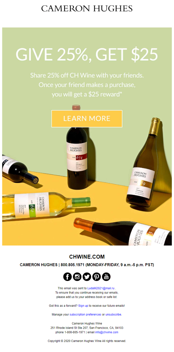
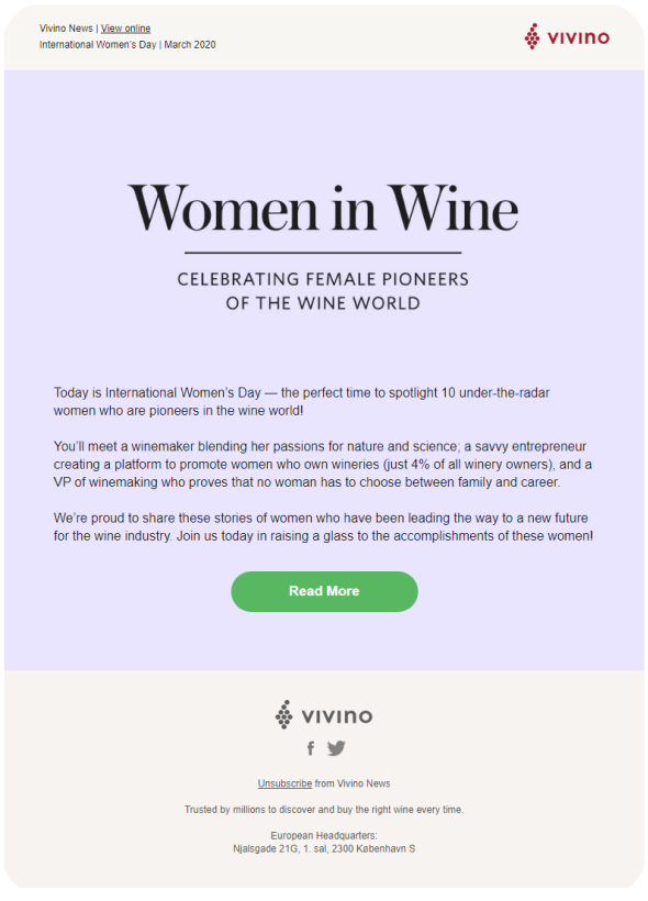
References
Regular emails
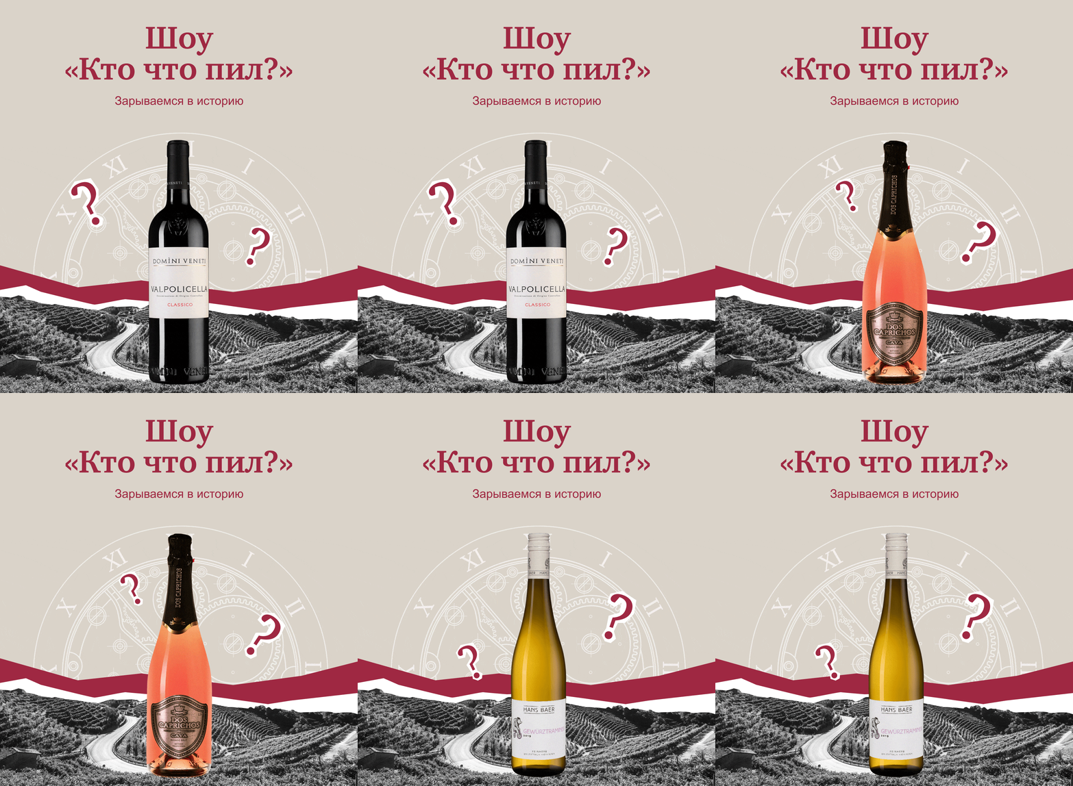
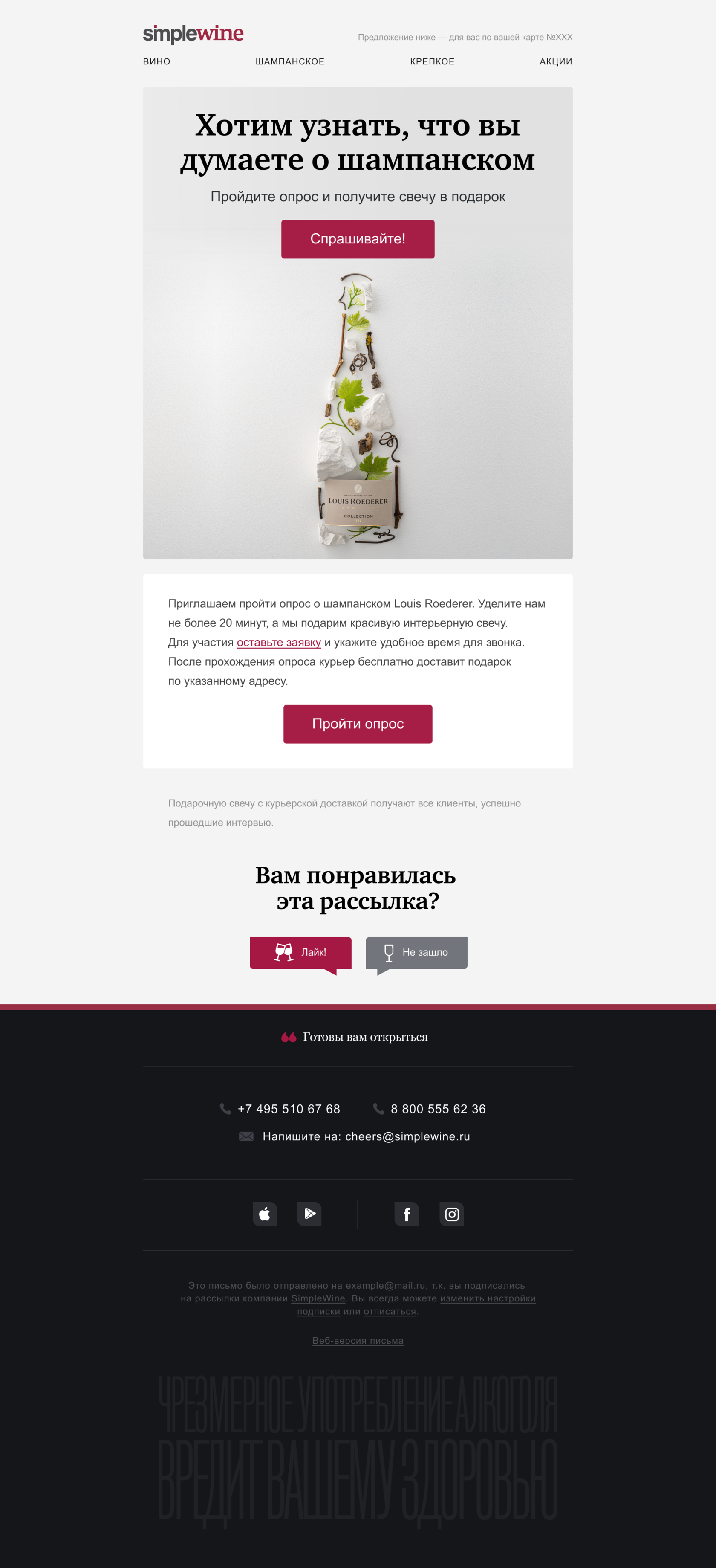
We made the background of the emails gray, and divided the blocks with the help of “islands”—since the brand’s emails are long, we decided to highlight the boundaries of the sections. Added a block with information on the loyalty program; in the product cards, the price of the product with a discount according to the customer's card is automatically adjusted.
All blocks are designed on a grid. We also completely redesigned the footer — we made it on a dark background, which visually separated it from the content part. We added a block with feedback about the email to each email.


Premium segment
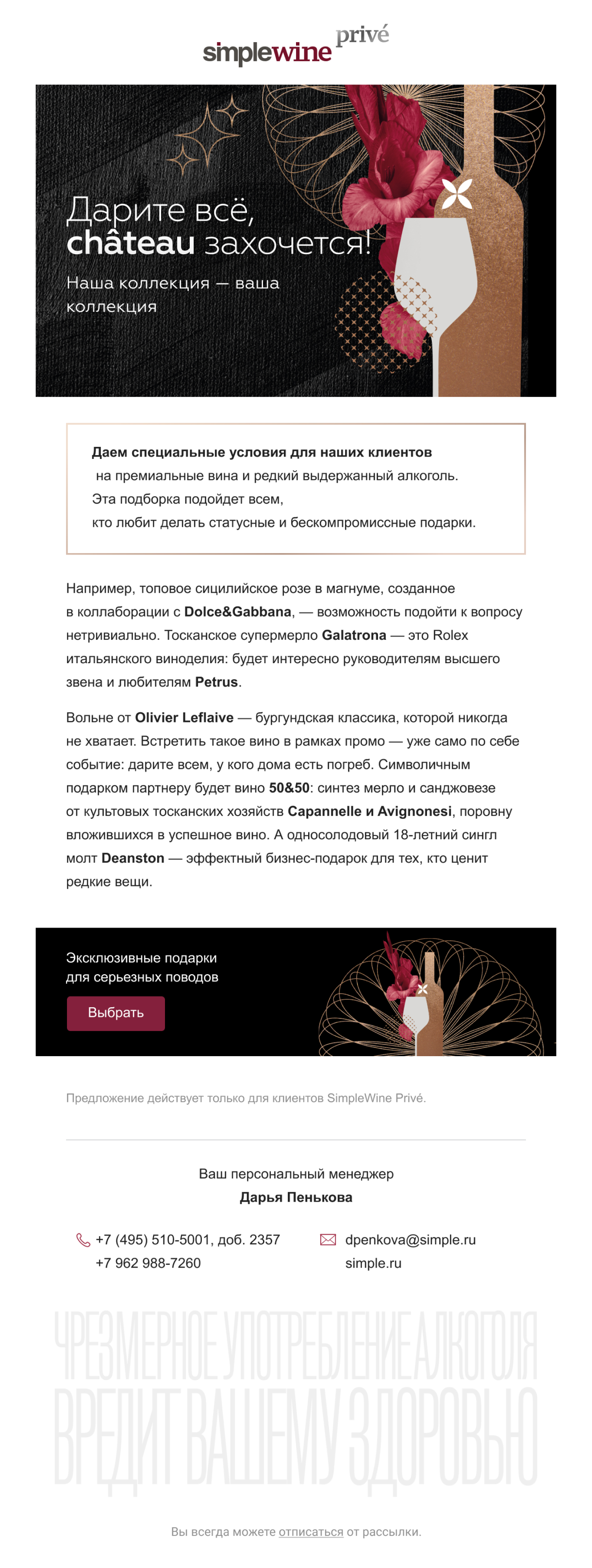
Premium segment emails have been made more minimalist. There are fewer icons, maximum information. We also added a block with the contacts of a personal manager to the basement.


Q&A
Once a week, the brand sends emails with answers to questions about the industry. We have developed a unified style for all the visual elements of the rubric, we use pictures with a natural theme. At the end of the emails, we made a block with the opportunity to ask your question.



Digest
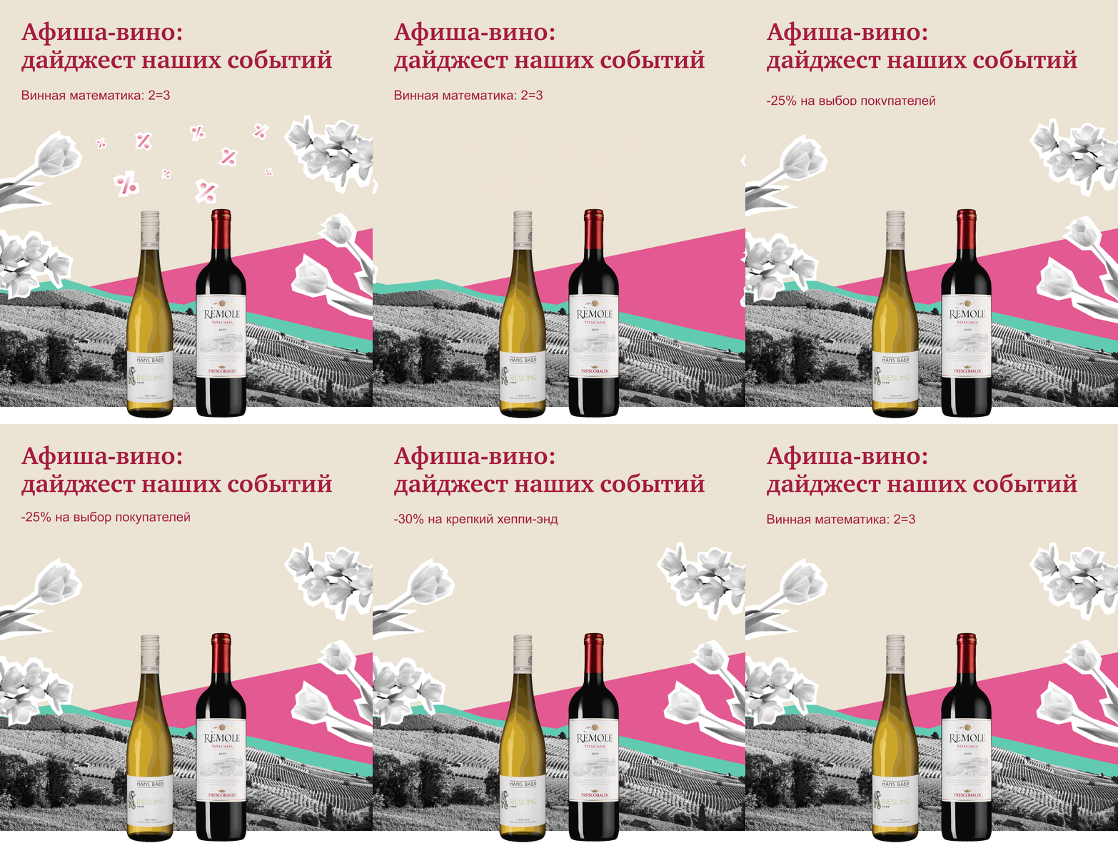
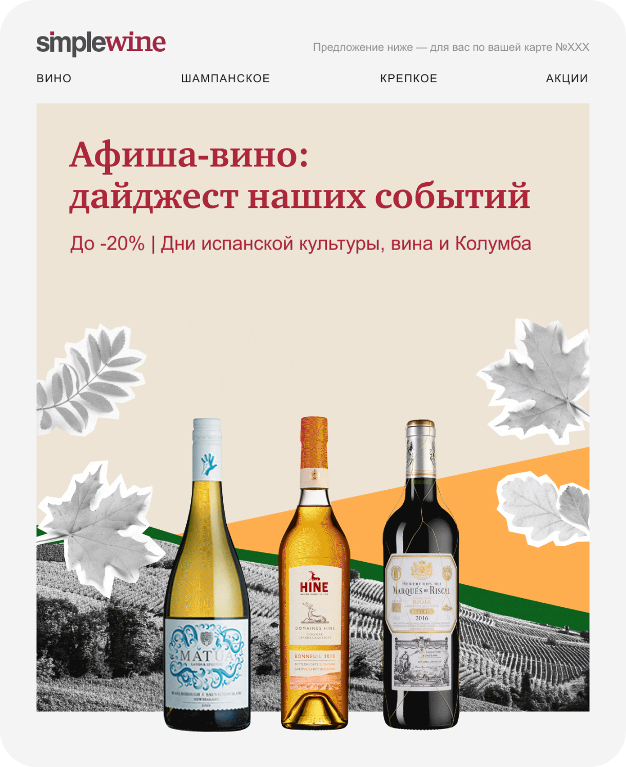
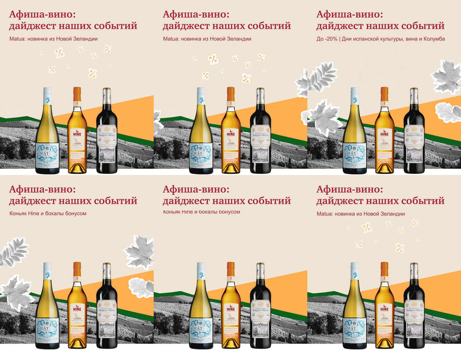
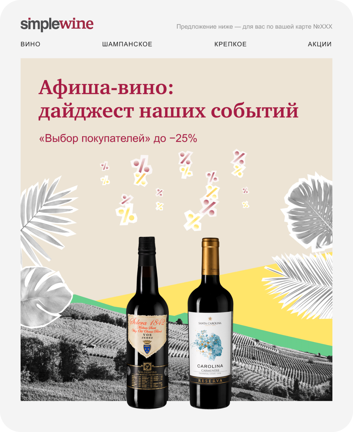
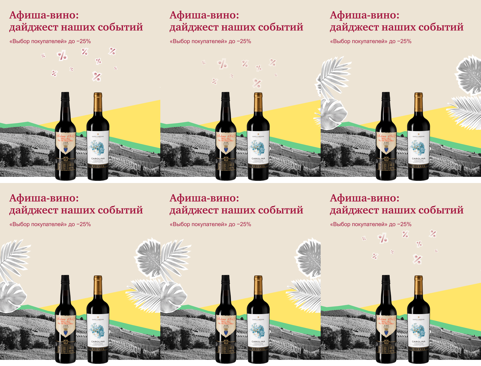
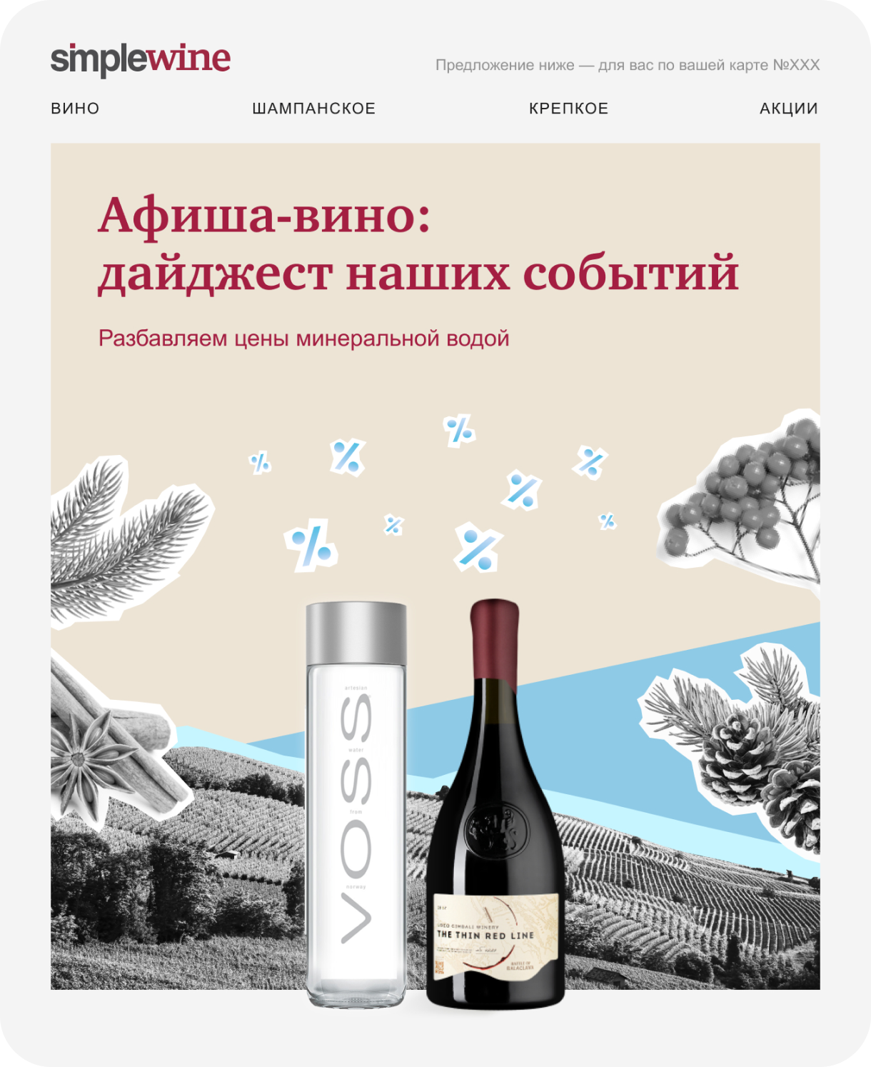
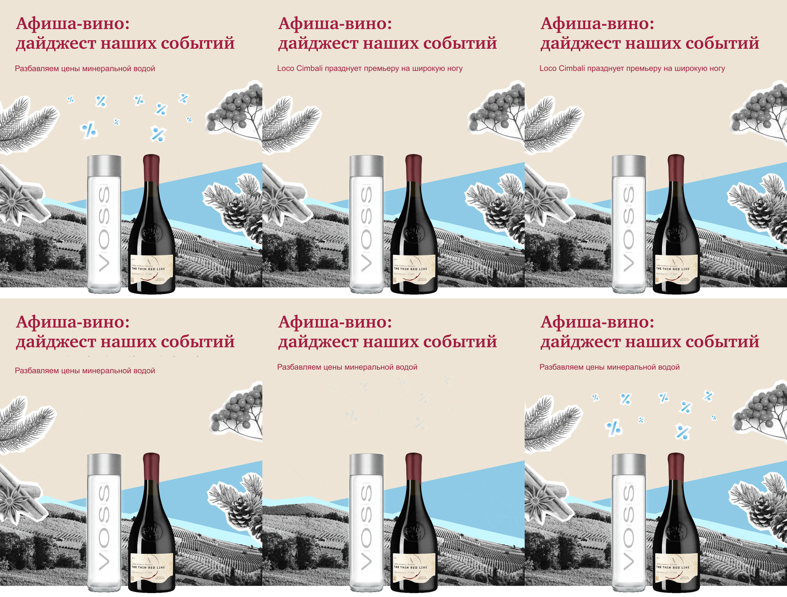
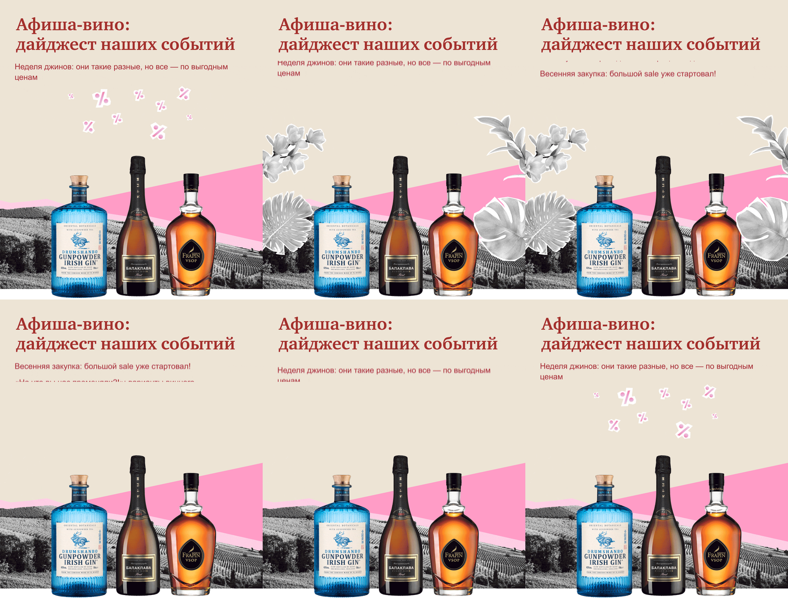
This is a new section of the brand. Here we have developed a new template from scratch. All emails with banner animation—every 3 months, when the new season starts, we change the style according to the season.


Adaptive
All emails are adapted for mobile devices and dark theme.


