
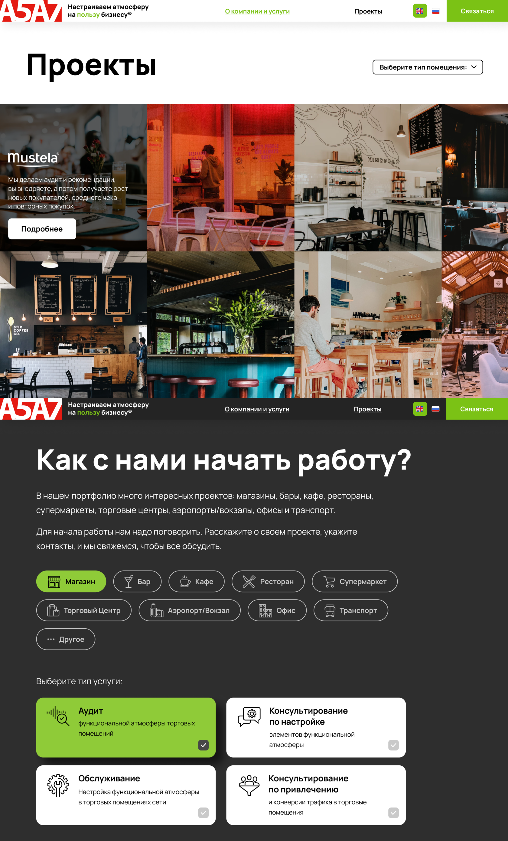
Goal: website design for sound accompaniment company, А5А7
A5A7. Website design

The main page
We created a conception and a design of the main page. It's like an interactive maze for the logo.
FONT-WEIGHT

FONT

Typography
Color palette


Elements
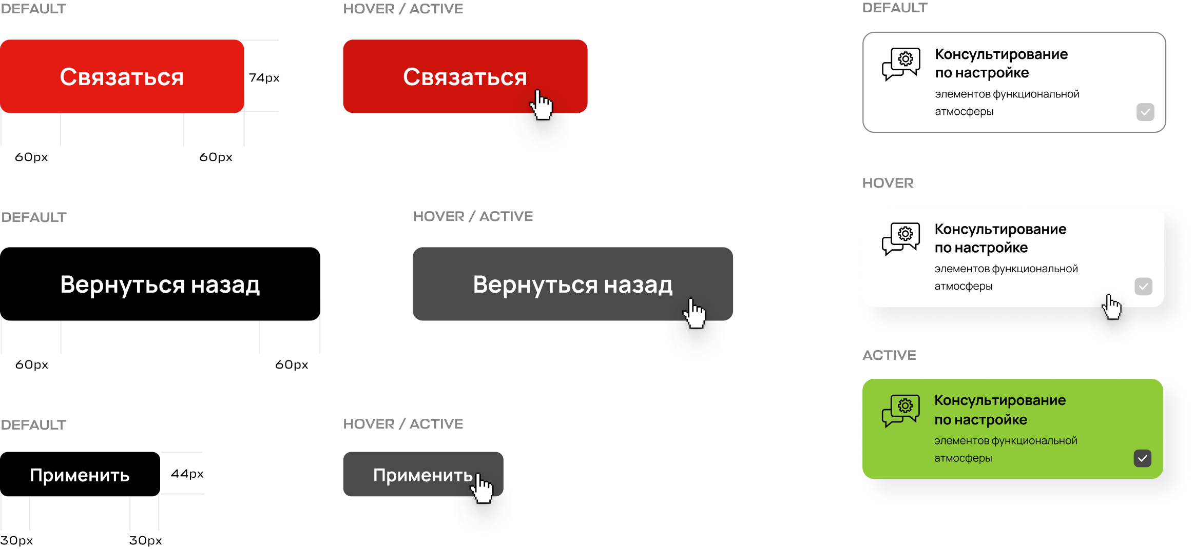
Navigation

Branded icons
We created the icons pack in the same style for to display various elements.

When the user scrolls the page, he hits on the point with important information and skips nothing.
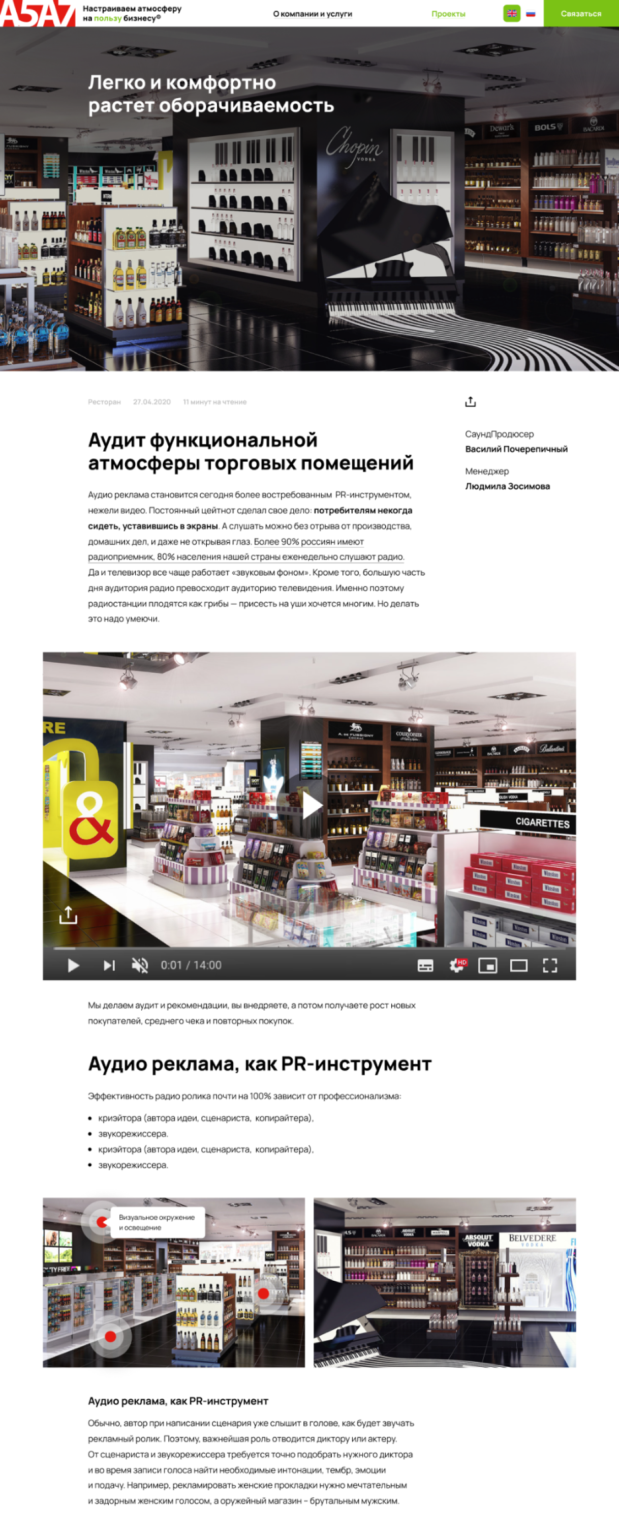
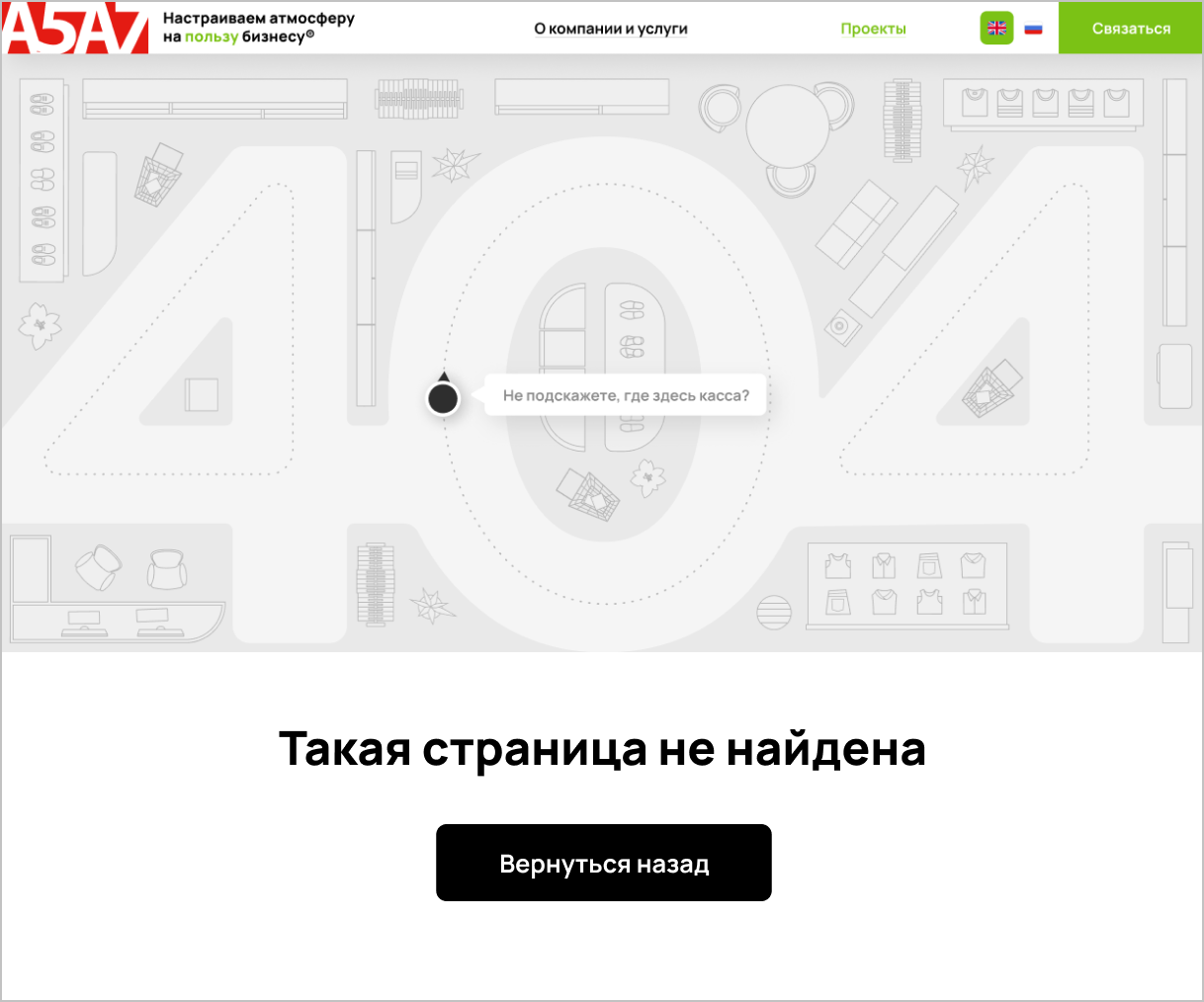
Internal pages
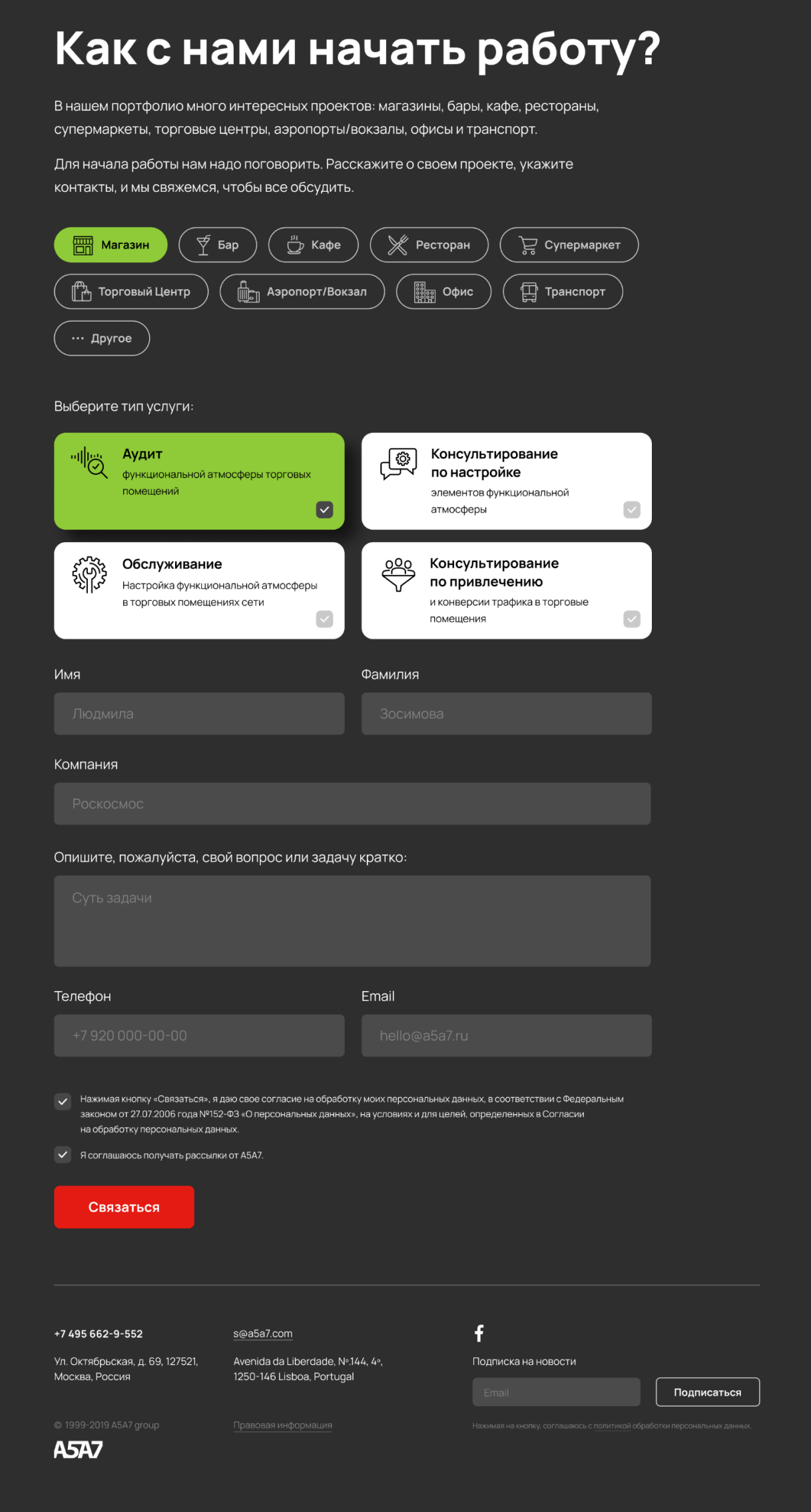
We placed the user-friendly application form. The user sees right now all available options, clicks on the ones he needs and makes a questionnaire. It's easy for site owners too. They receive detailed uniform application forms.


A lot of users scroll sites from mobile devices. We took this into account and thought how the blocks should adapt in the mobile version.
Adaptive design


