

Aviasales. Design refresh
Task: update emails in accordance with the client's rebranding

Old design
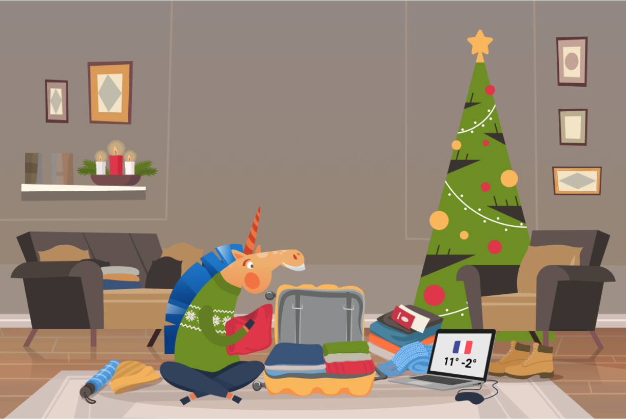
In the previous version of the emails, the images were flat. The client wanted to add a modern touch to the layouts using 3D and a new corporate identity.

Old banners






What have we done
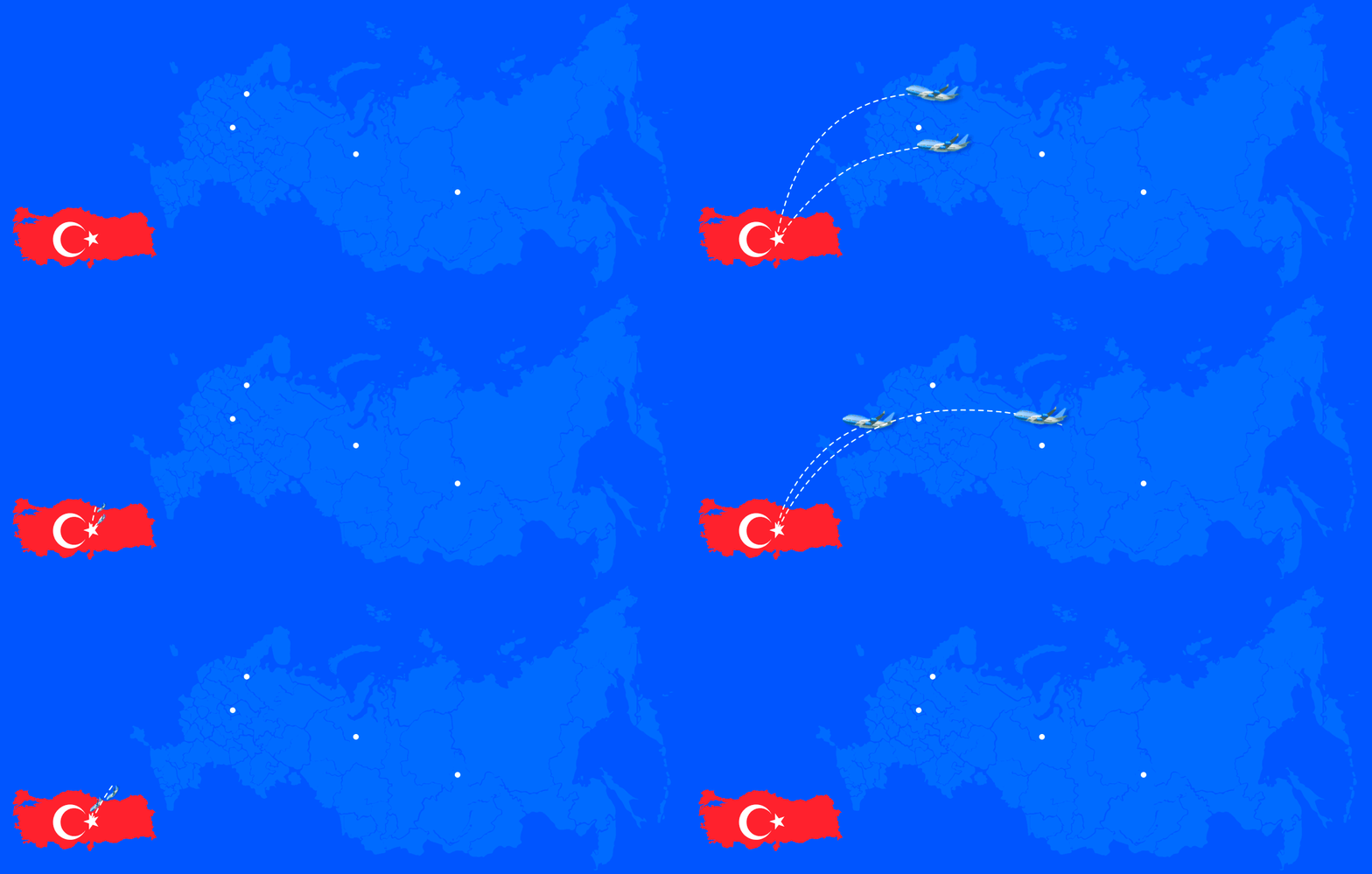
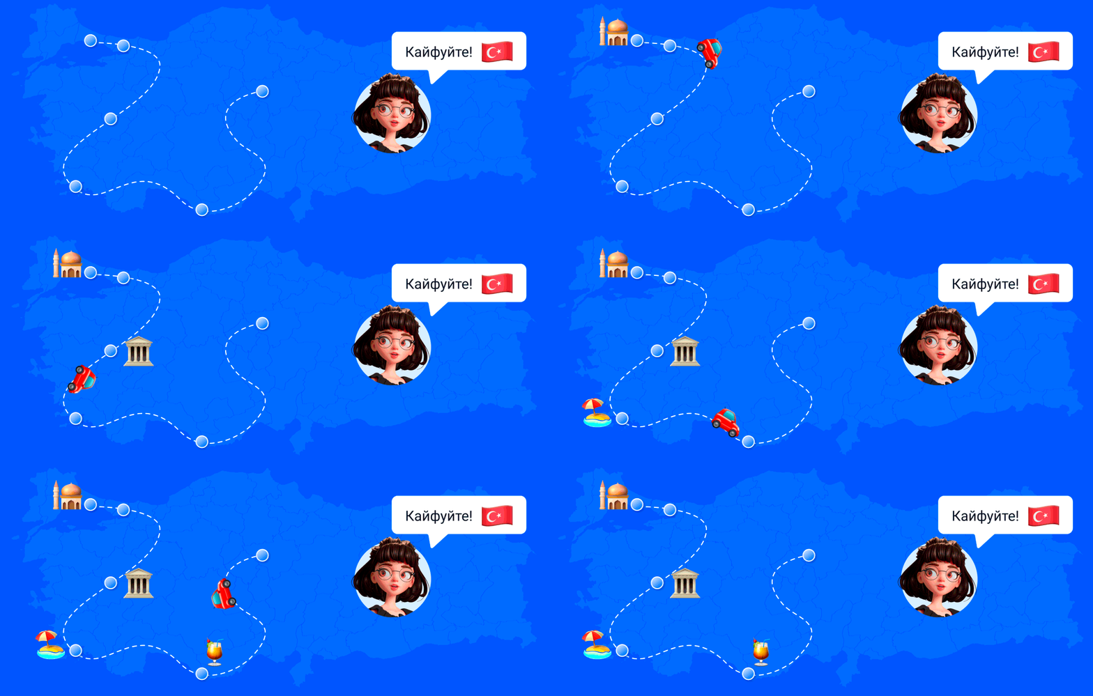
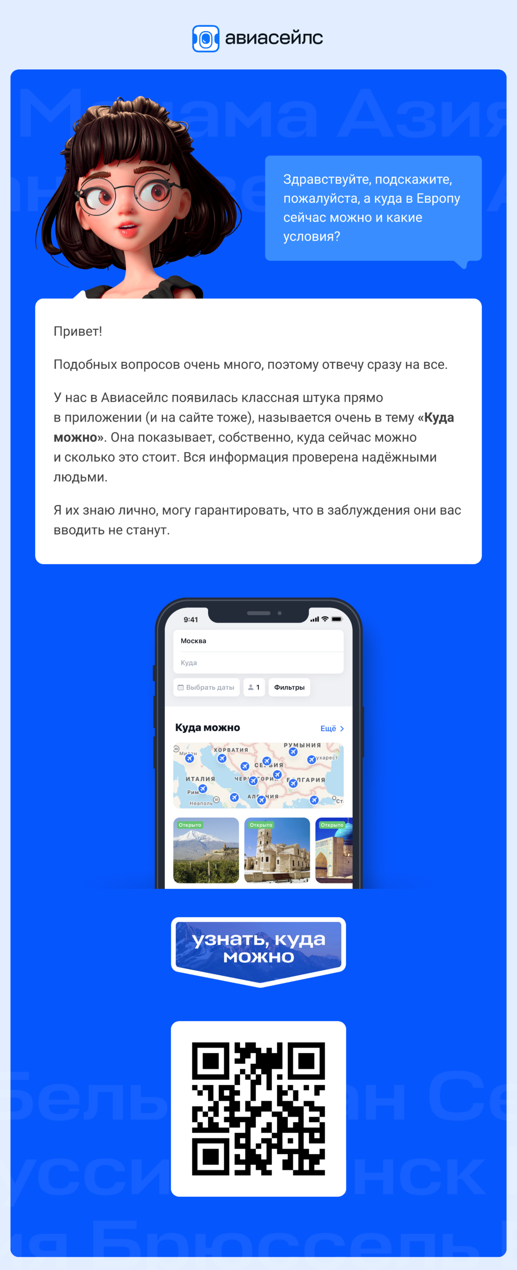
We have made mailings brighter and more airy. As a lantern, a catchy and memorable blue color is now available. Computation was replaced by 3D: shadows, volume and realism.



Adaptive
All blocks adapt to mobile devices, while maintaining readability and concept.


