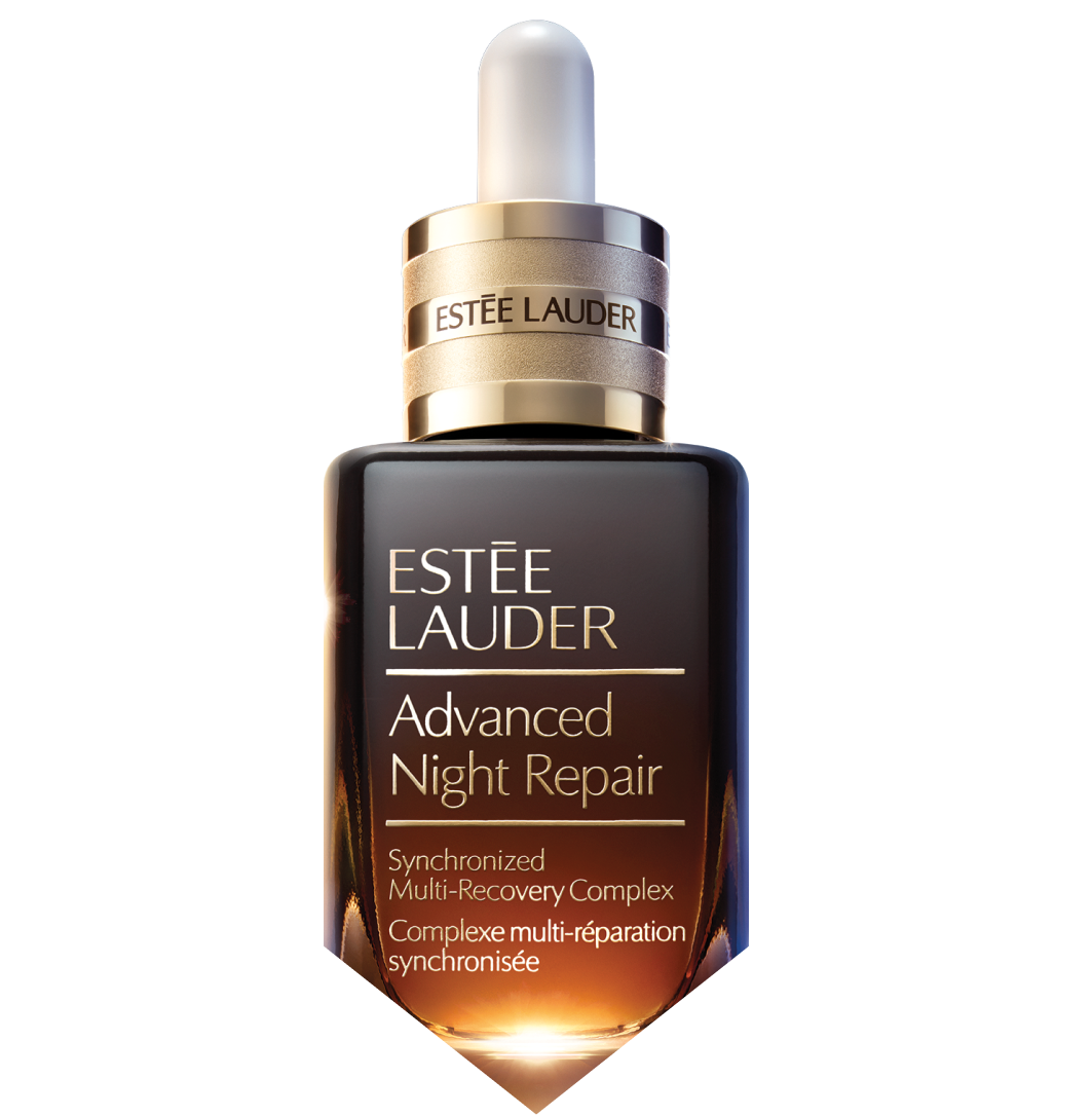
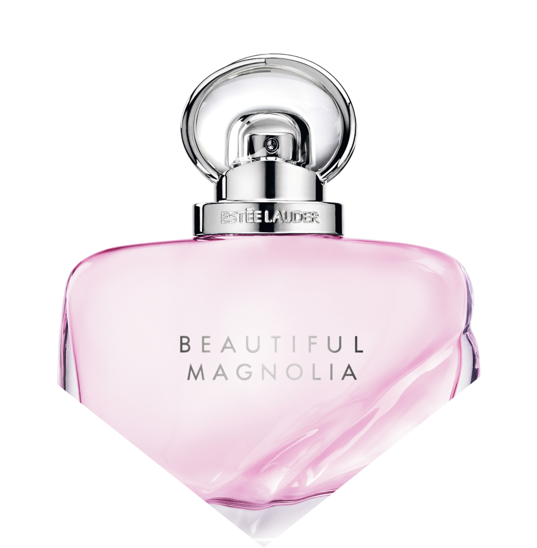
Old design
In the previous version of emails, there was no header, and the footer was limited to icons with social networks. I wanted to refresh the overall design in line with current trends, giving the emails a character and feel of the premium segment.
References
Result
We made a header—we added the main sections of the brand's website to it. The font was made more readable and emphasizes the main idea of the text. The design has become saturated and speaks of premium. Icons appeared in the footer showing the user the benefits of online shopping.


Adaptive
All blocks adapt to mobile devices, while maintaining readability and concept.


