Mailfit Agency — Landing page on landing pages
Goal: to create an interactive landing page to attract new customers
Web


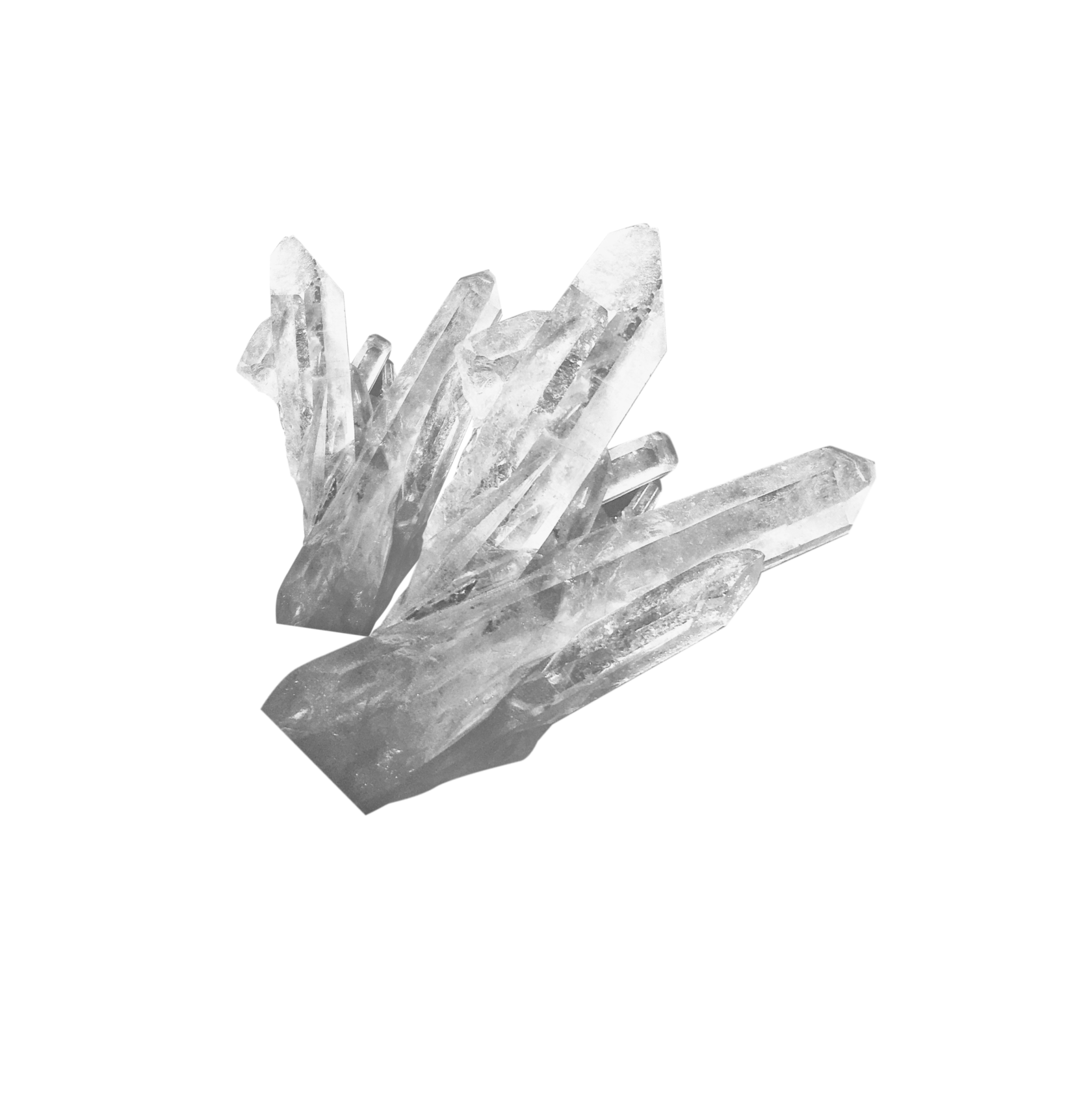
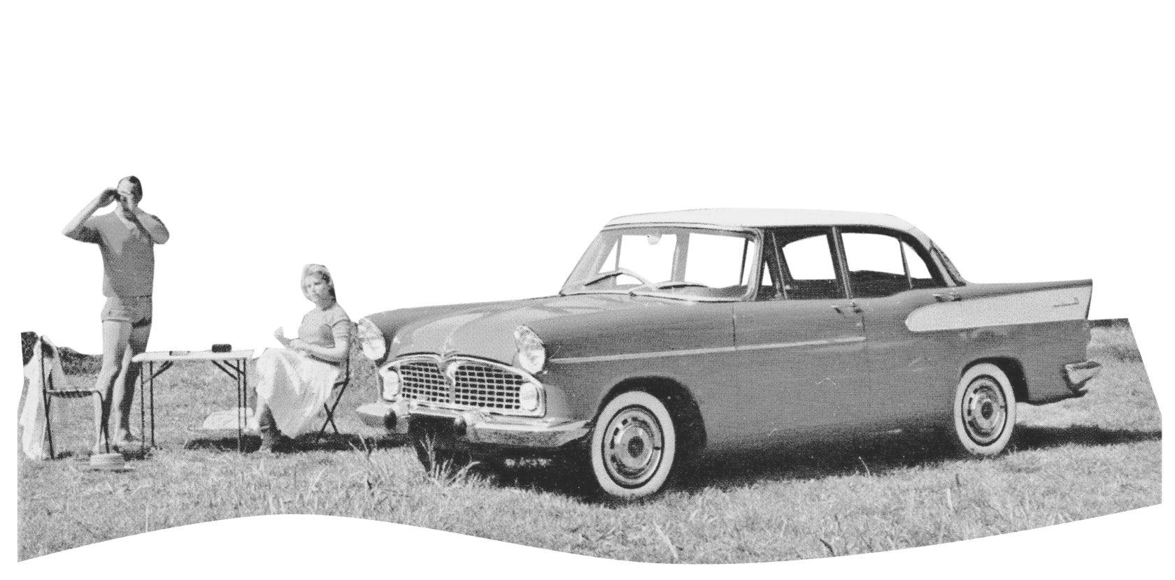
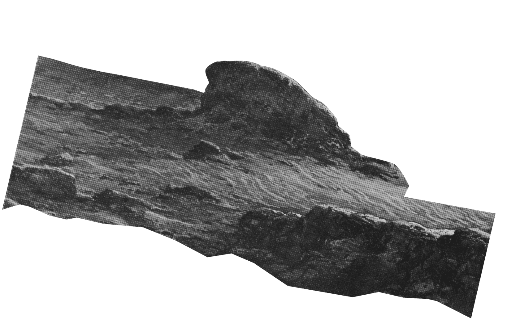


The creation process
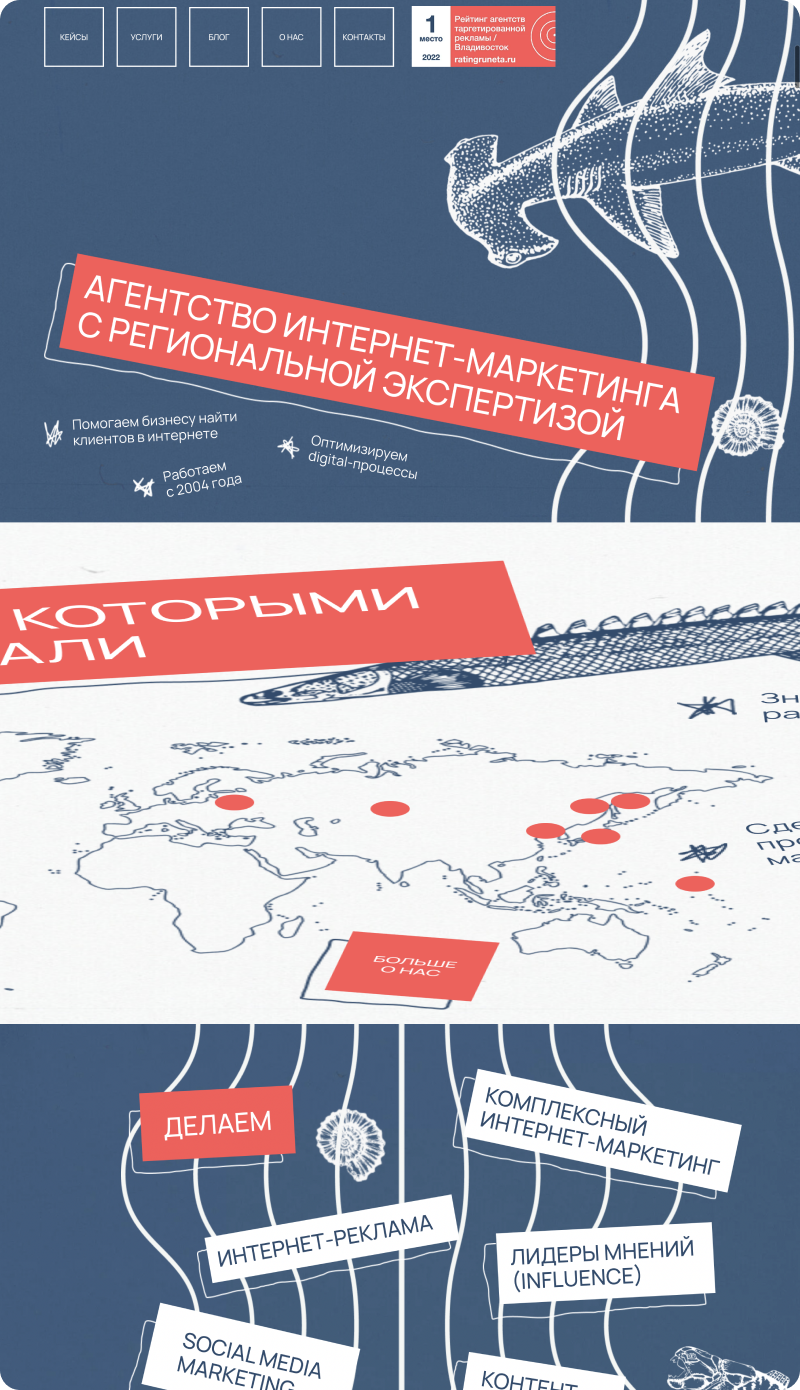
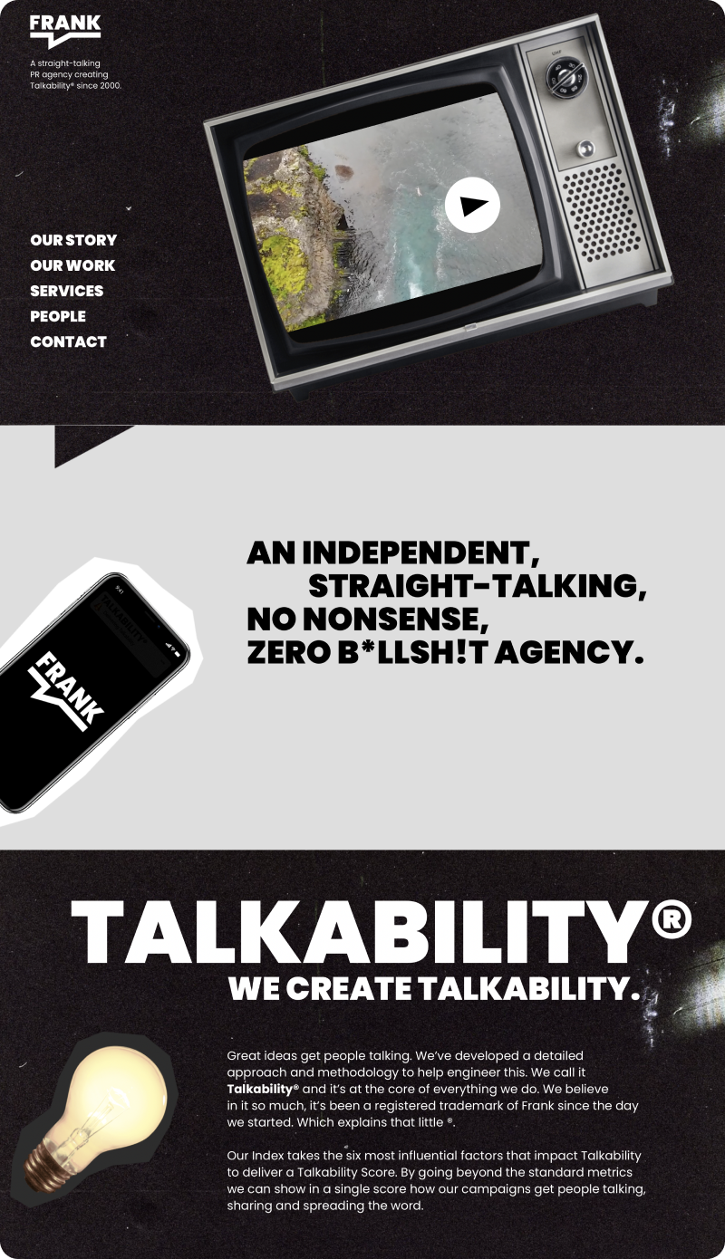
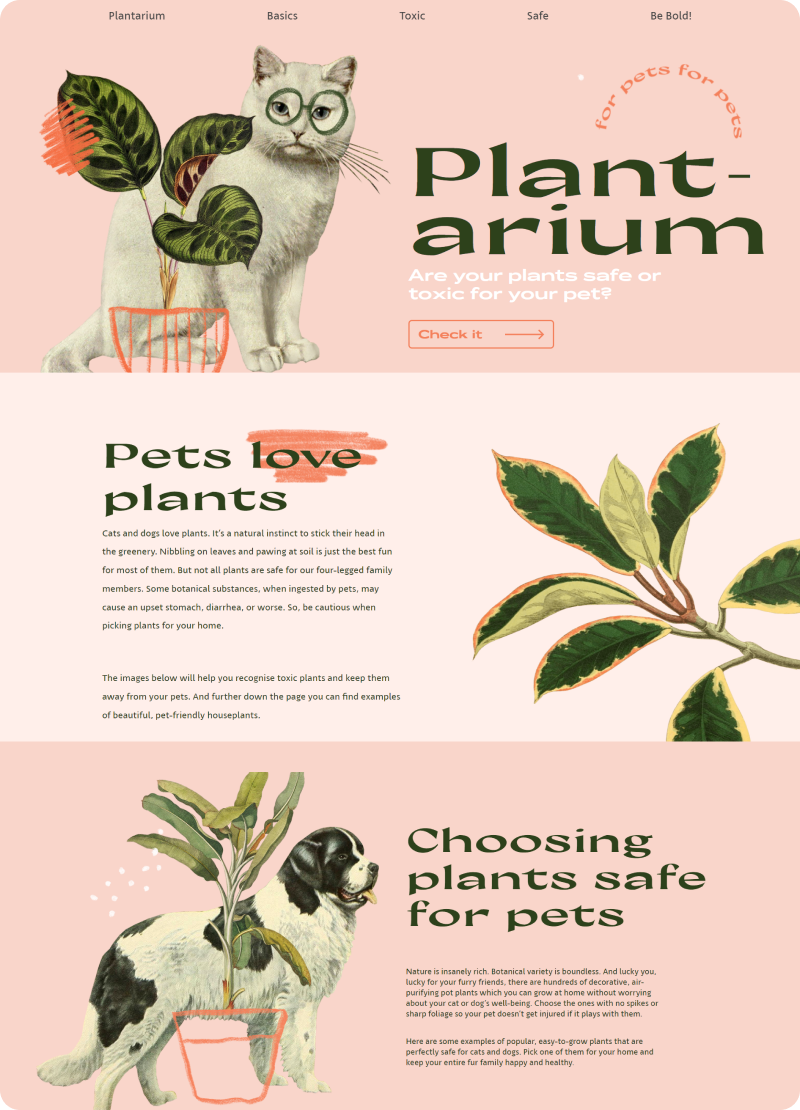
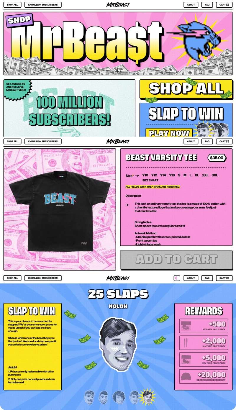
The idea was to do something bold to create the most sticky and impressive landing page that will demonstrate all the capabilities of the team.
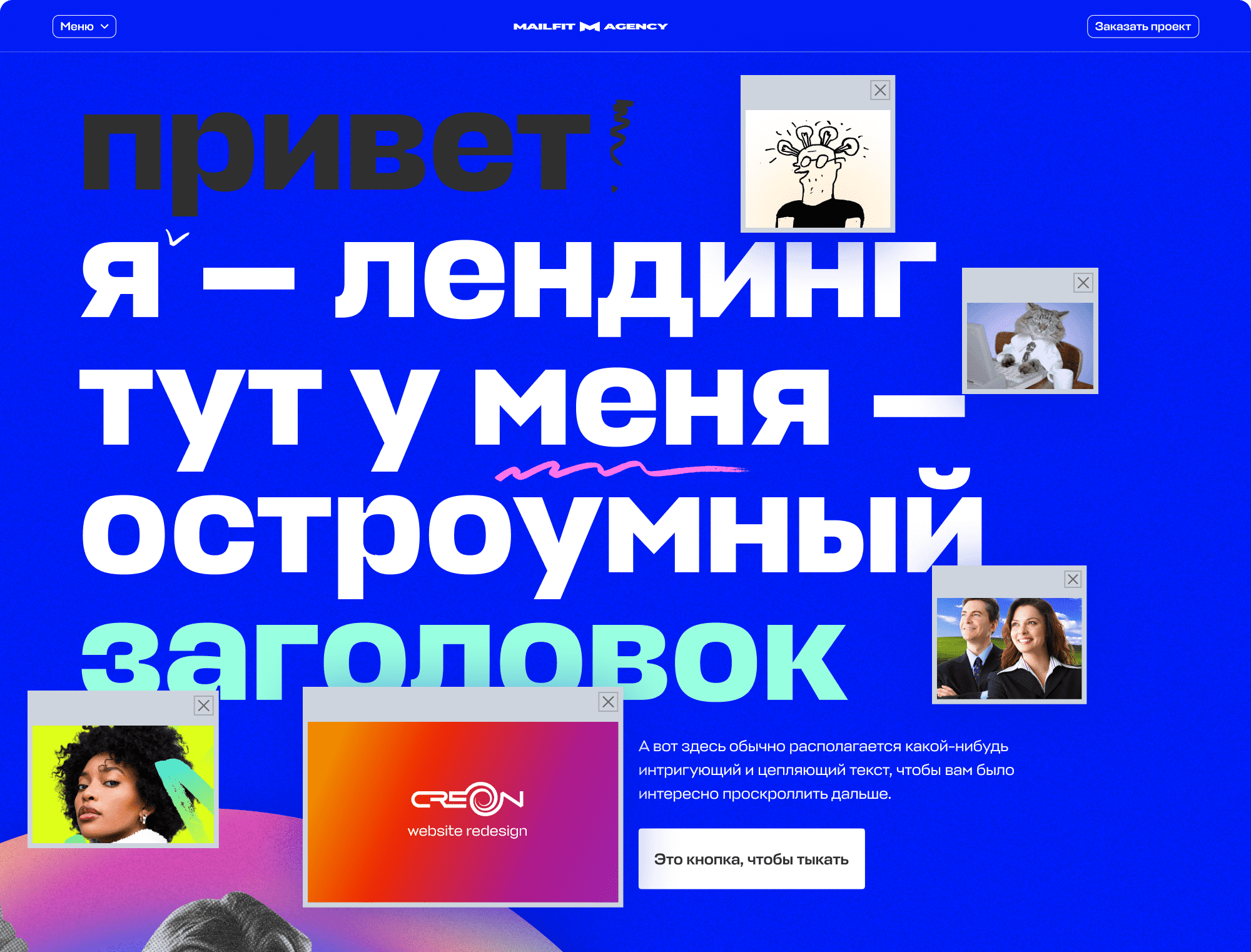
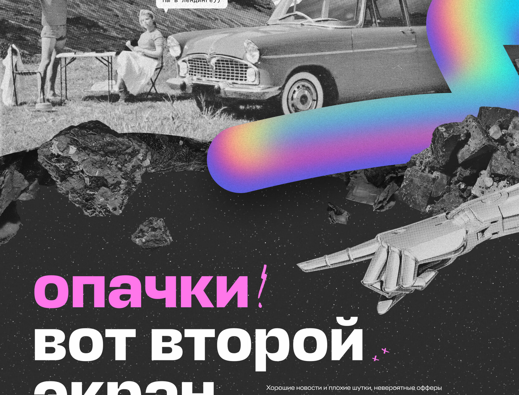
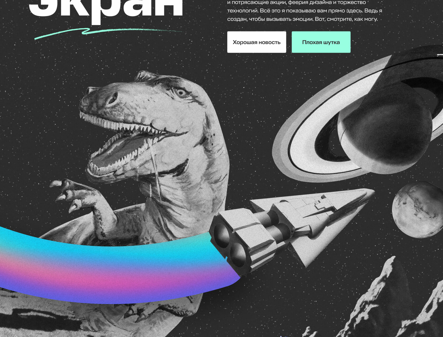
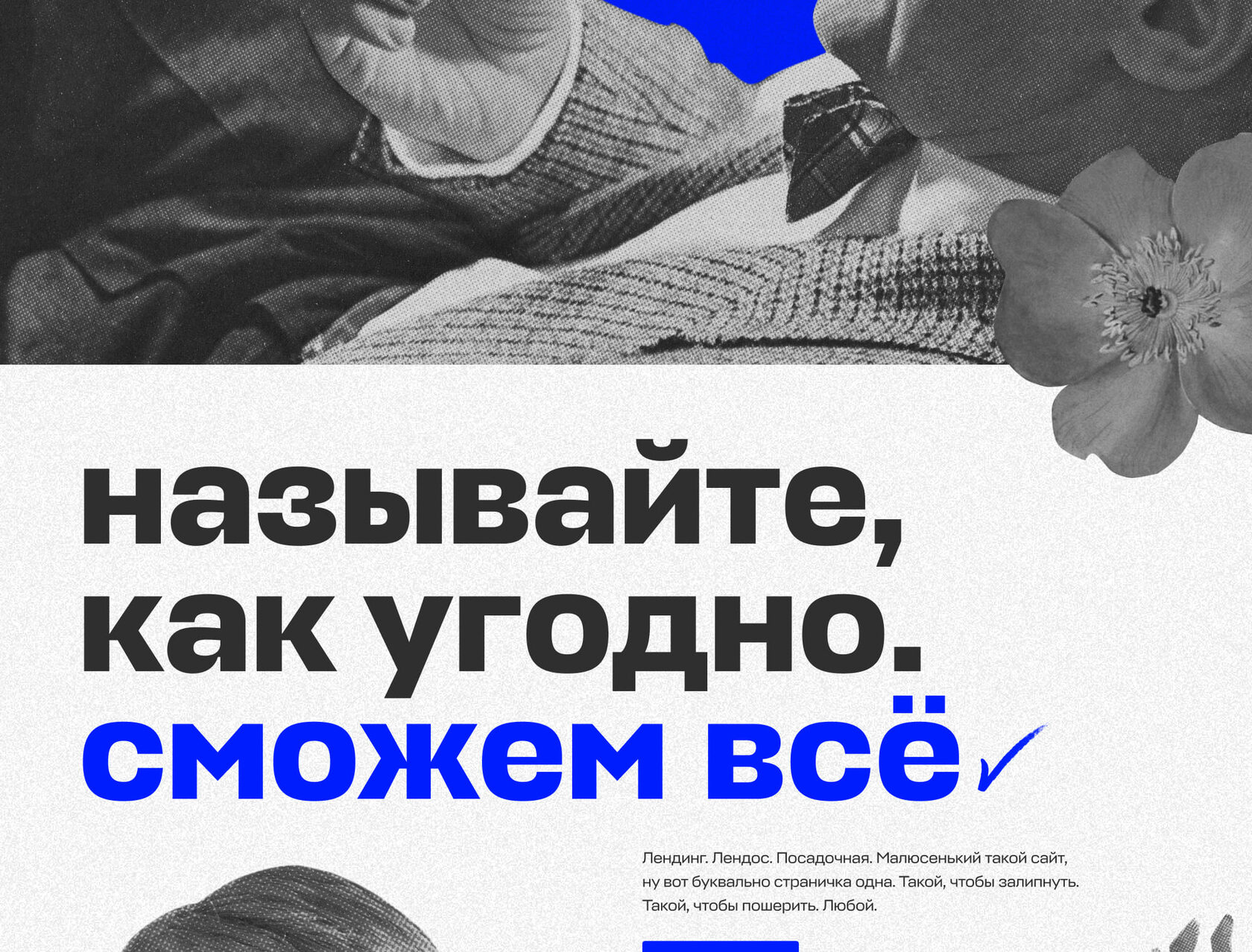
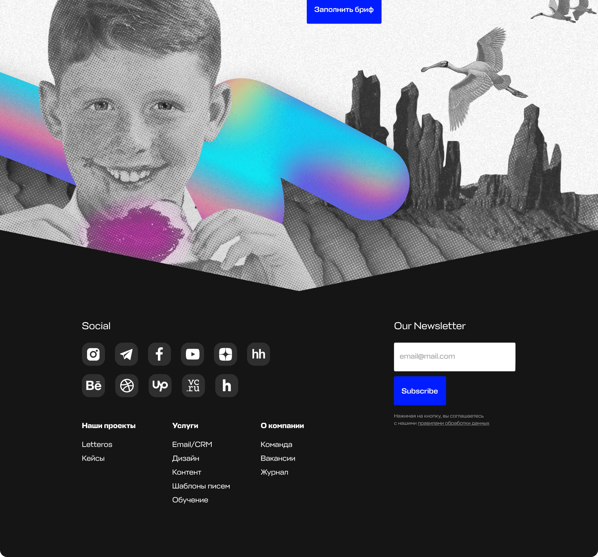
To get more involved, we used animated elements and interactive windows. The visual emphasis was placed on vintage collages and futuristic graphics.

Fonts
We used the brand's signature font in common and added JetBrains Mono pointwise to create contrast.

Main Typeface

Fonts

Сolor palette
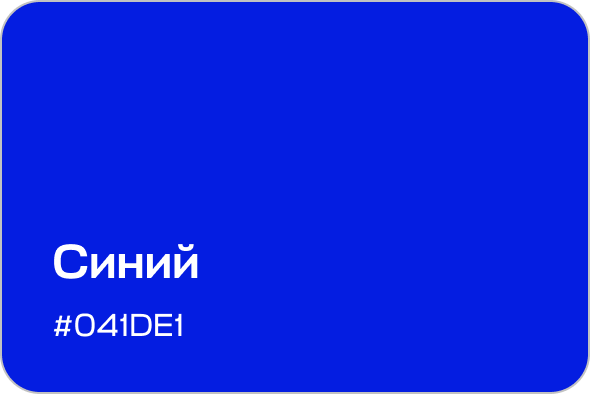
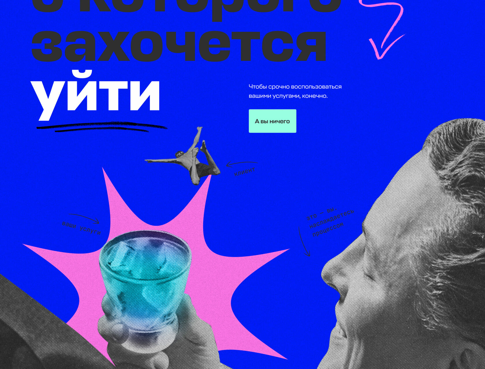
The brand palette was used as the basis. But to create something special and emphasize our main idea we added star sky to the background.


Illustrations
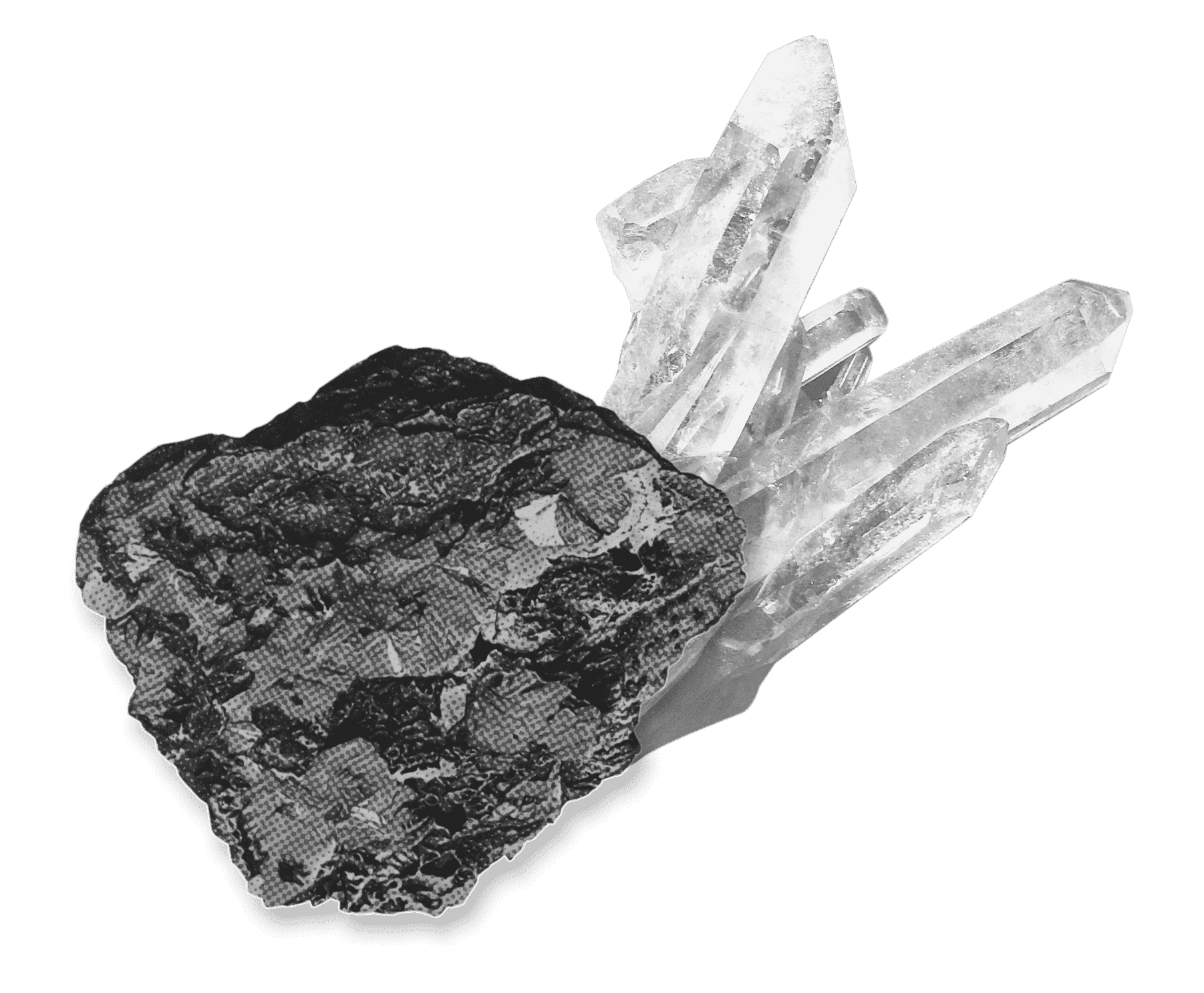
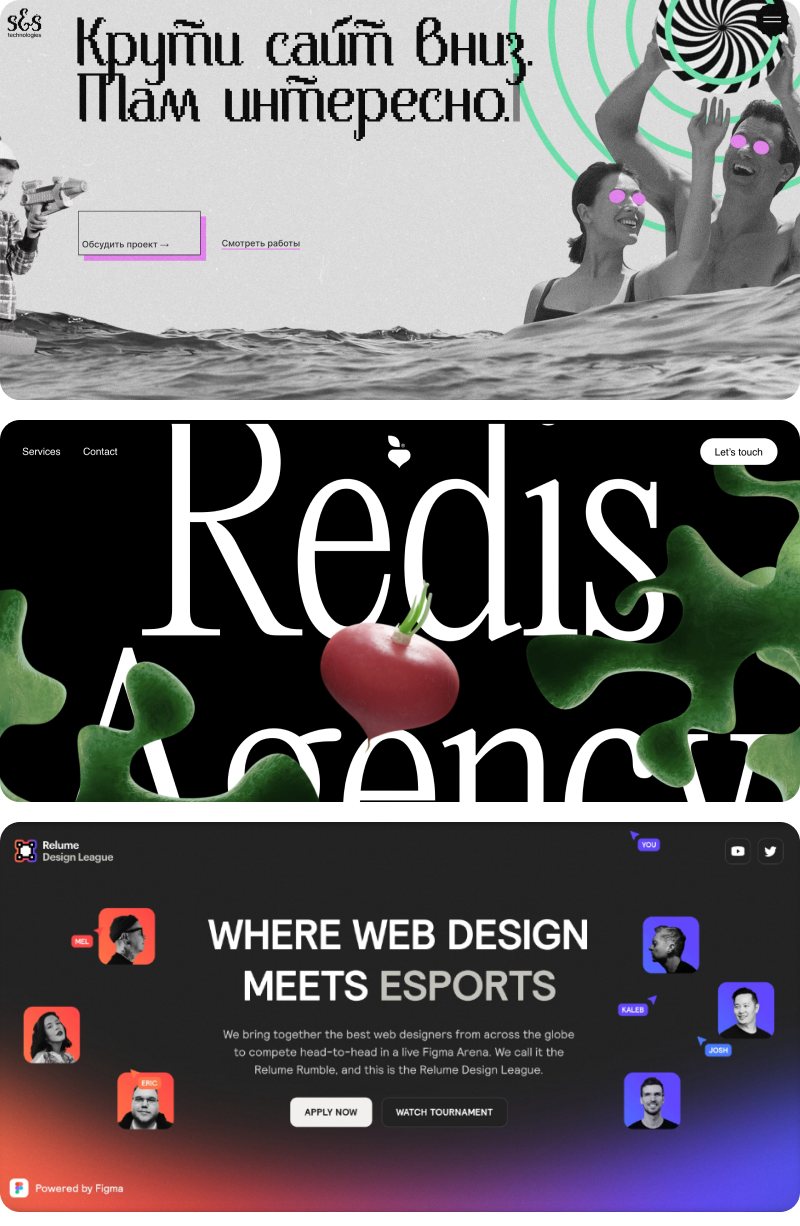
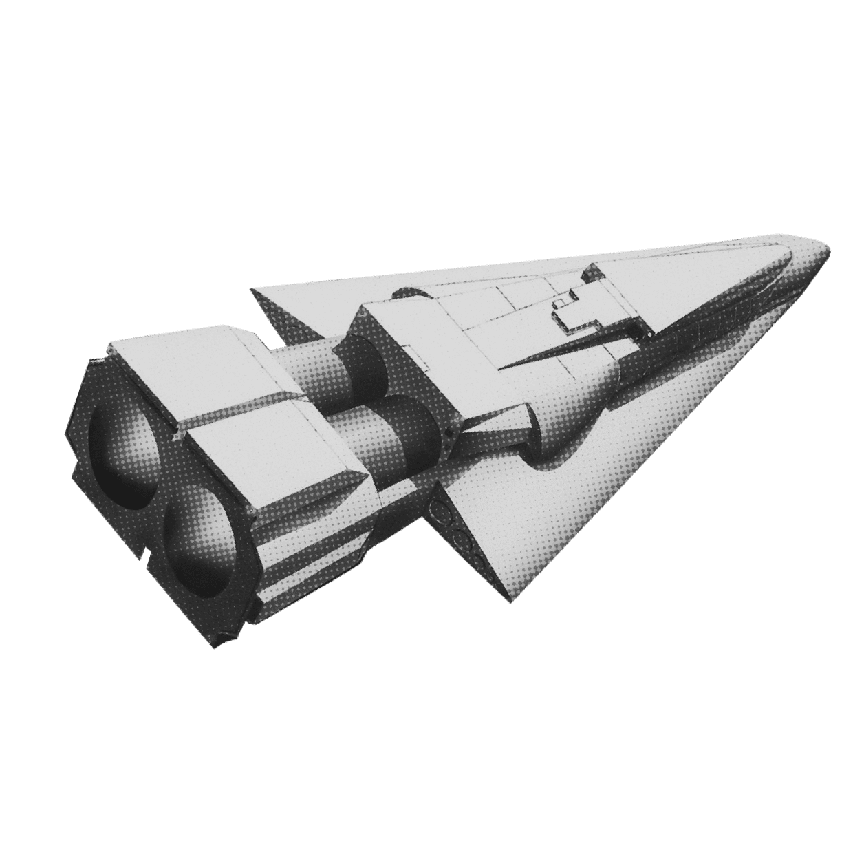
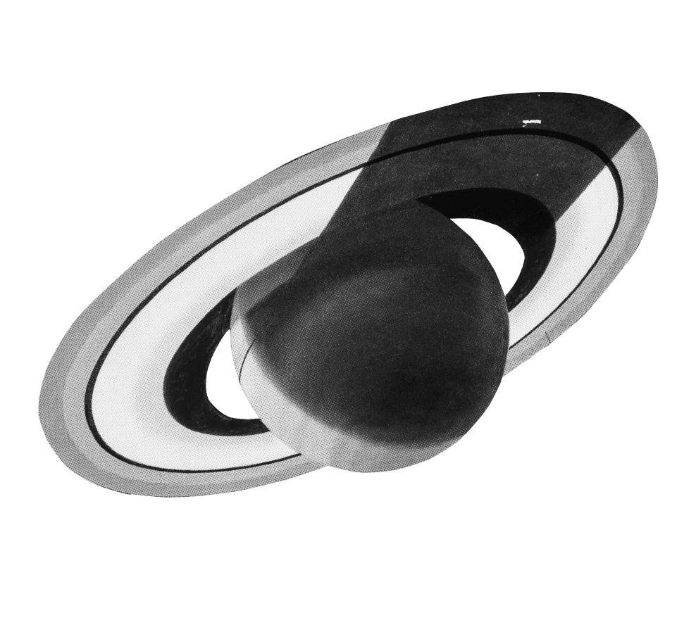
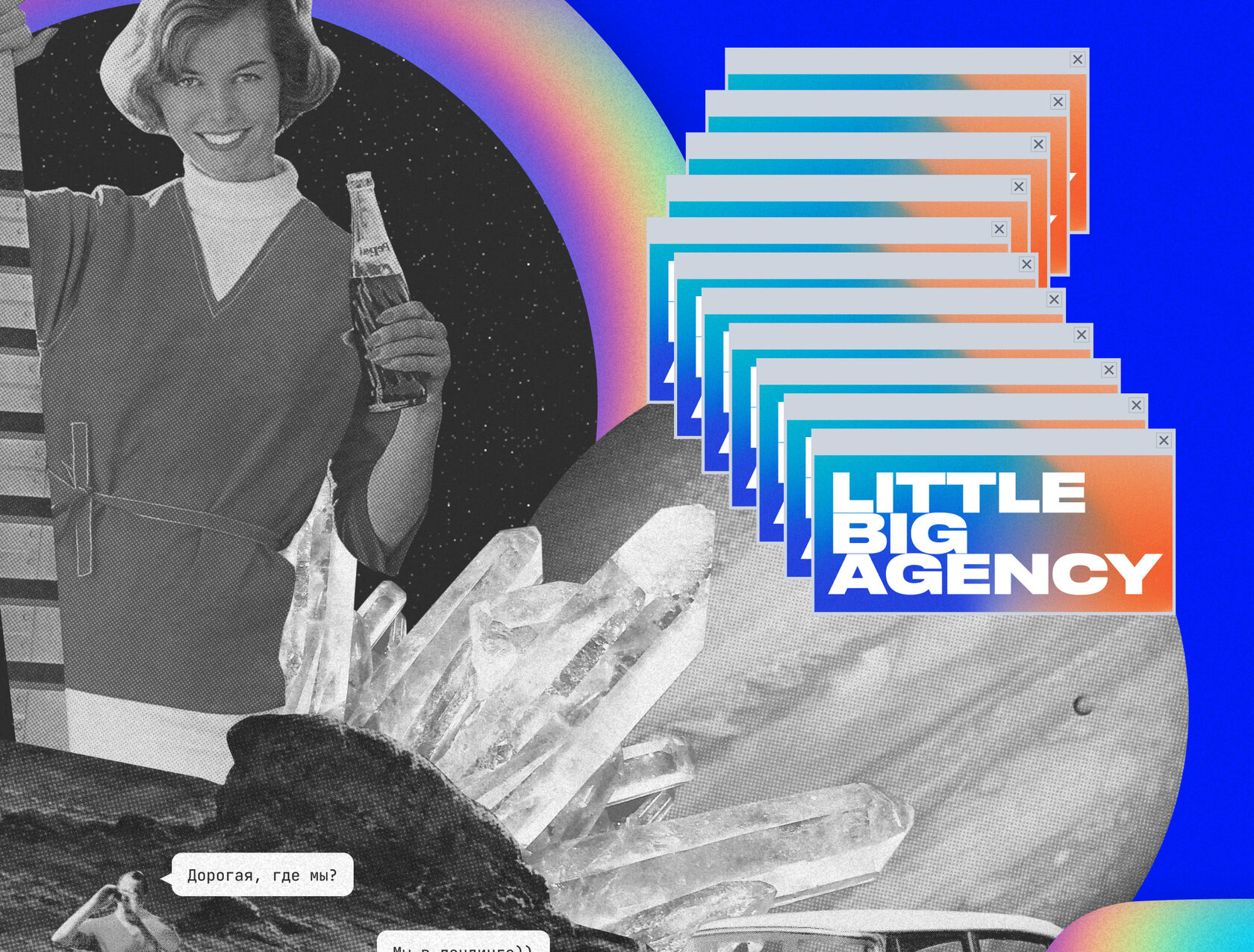
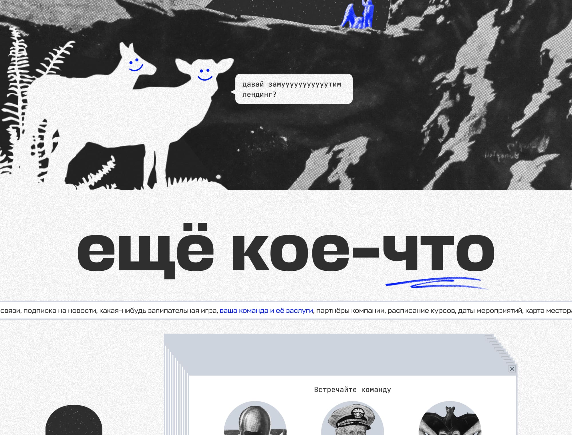
We mixed the vibes of old American ads and graphic futurism to get a stylish eclecticism. First of all, we picked the appropriate retro images, and then added graphics: textures, inscriptions and other hand-drawn elements.

Individual elements
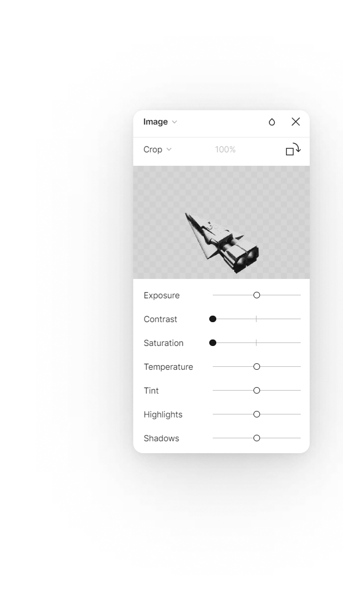
All the windows on the landing page are interactive: they can be moved and closed by the user. Clicking on them opens useful materials for potential clients that demonstrate a wide range of services of the Mailfit Agency team: cases, websites, presentations, elements of corporate identity.



Our favorite block
On the landing page we have a form where we suggest to say hello to us. We get a whopping 63% of our site visitors saying hello every day. It’s a great tool to measure engagement. Would you like to say hello to us too? Follow the link!


Result
A creative landing page that one would want to watch to the end and click all interactive elements. We wanted engagement — we got it.



Adaptability
The landing page looks awesome on all devices.


Just see for yourself


