TVOЯ пицца. Дизайн лендинга
Задача: разработка лендинга для службы доставки «TVOЯ пицца»

Task: creating a landing page for an SMM agency
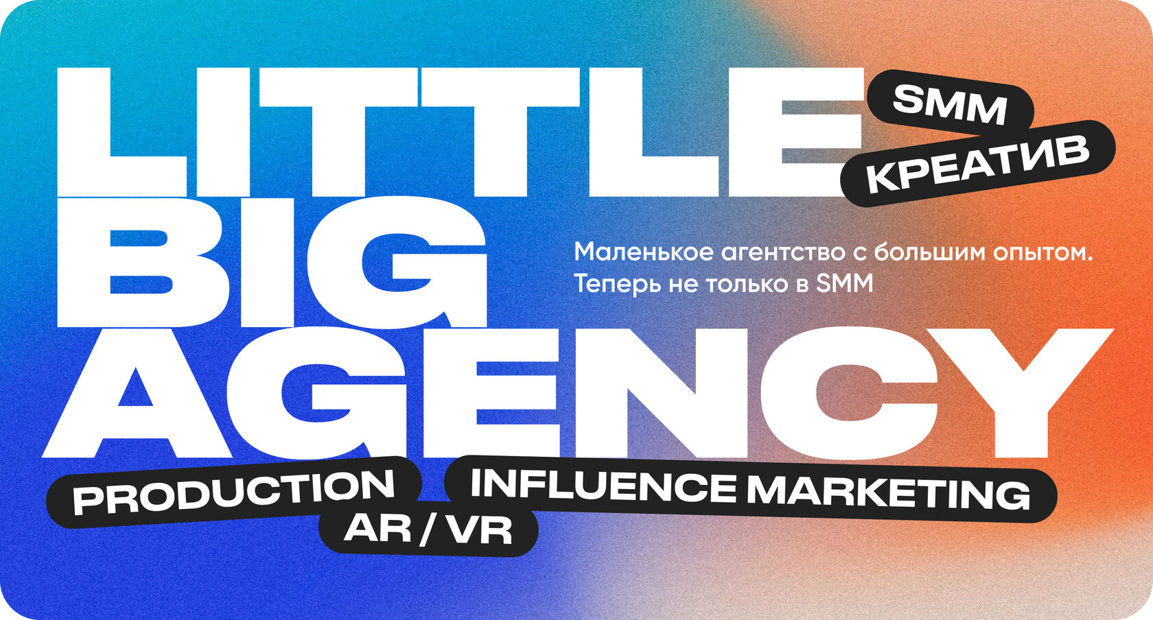
Little Big Agency.
Website design and layout



First of all, we found references. We collected the same bright, unusual and creative pictures as our customer :) Since the landing page is quite short, we needed something catchy and WOW.
Process of creation
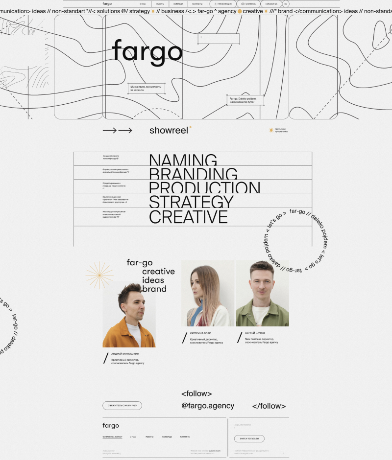
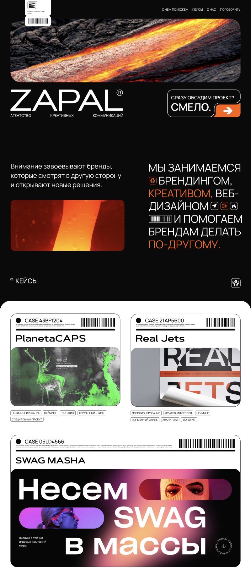
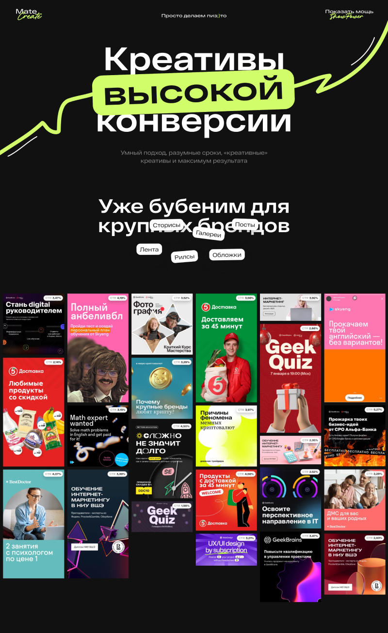
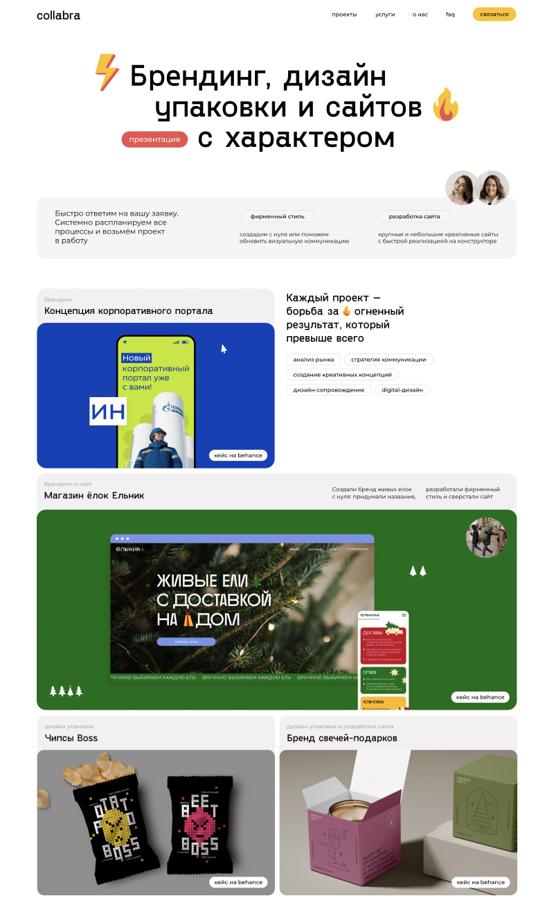

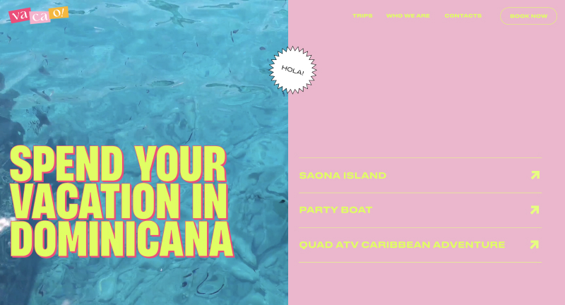
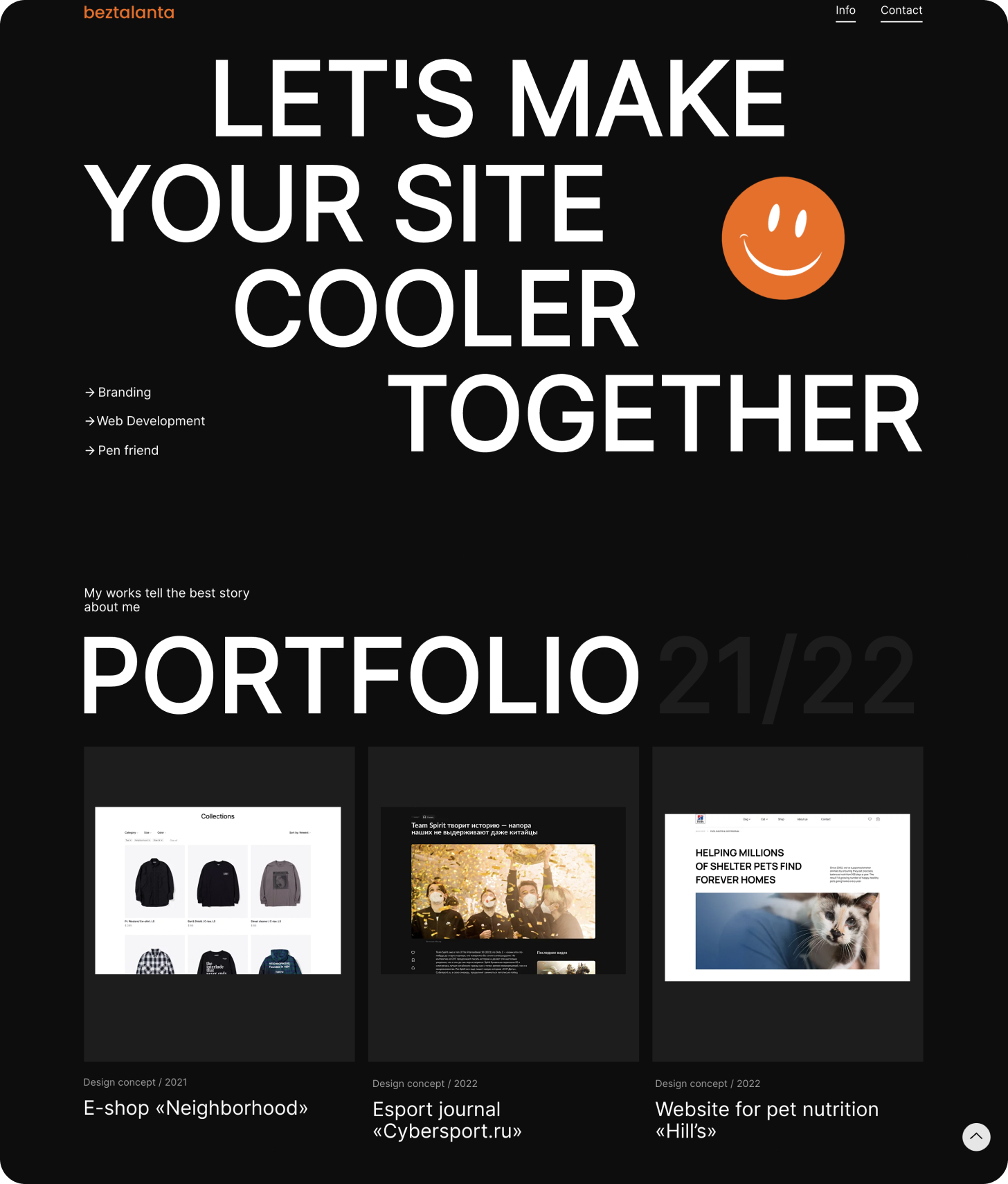
After we figured out the references, we started to create the concept of the first screens.
Process of creation
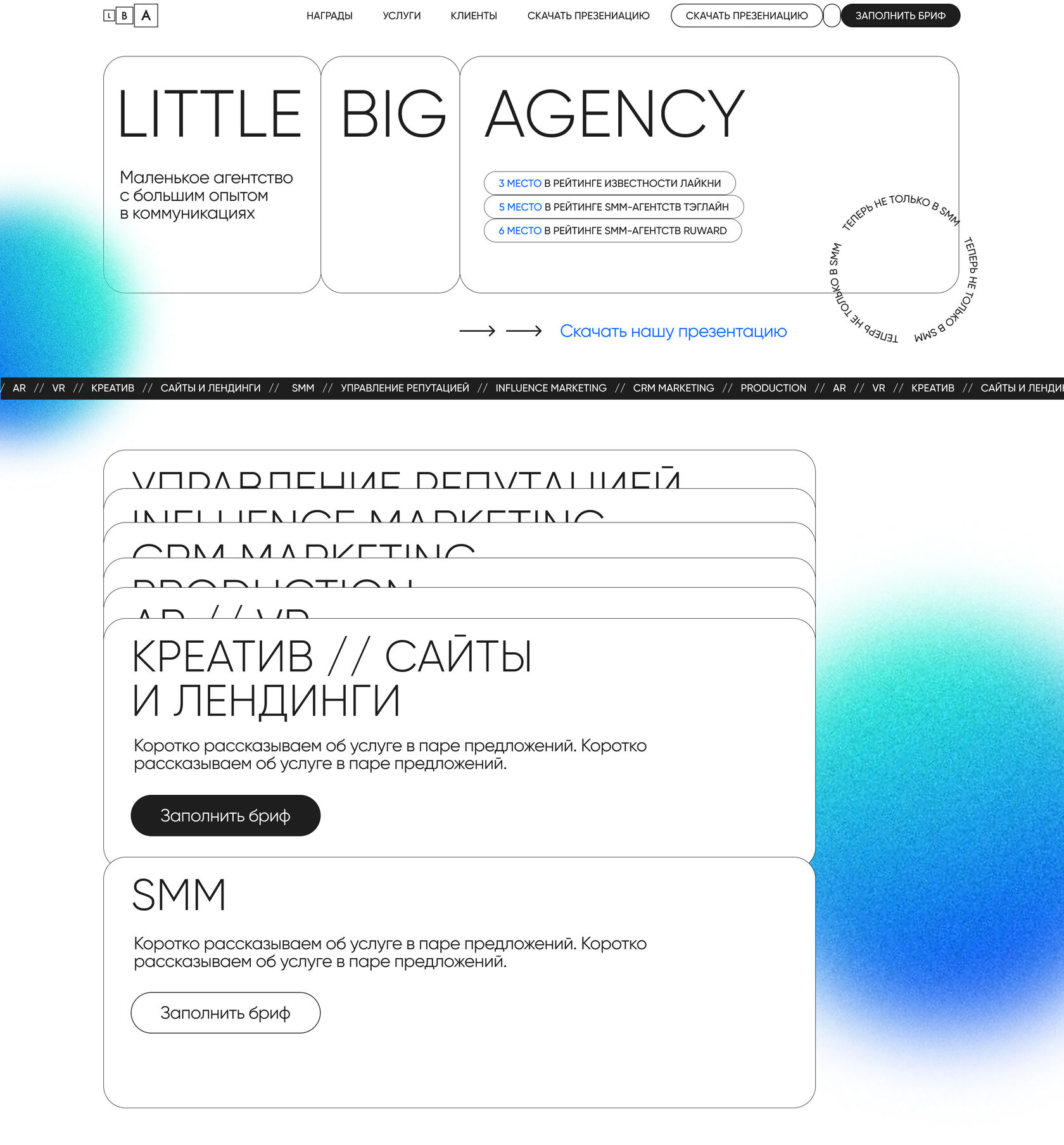
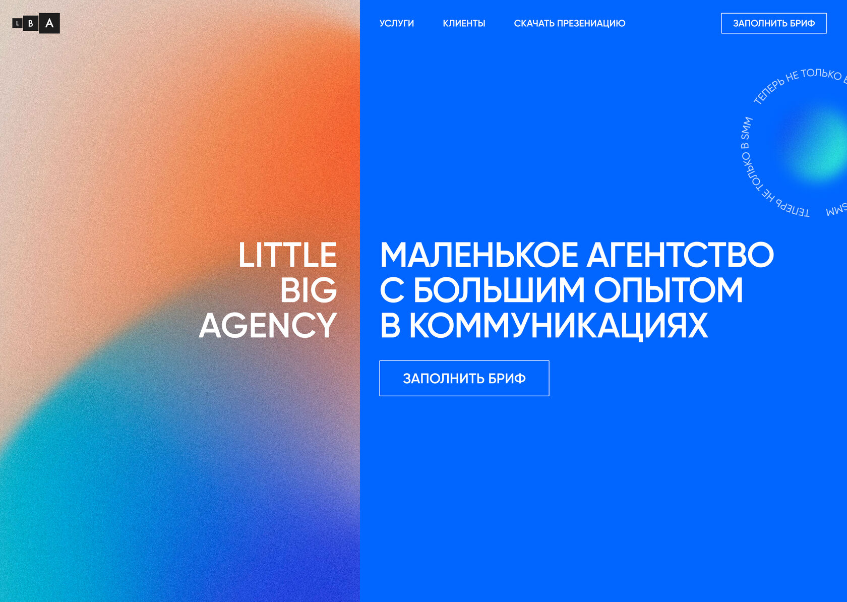
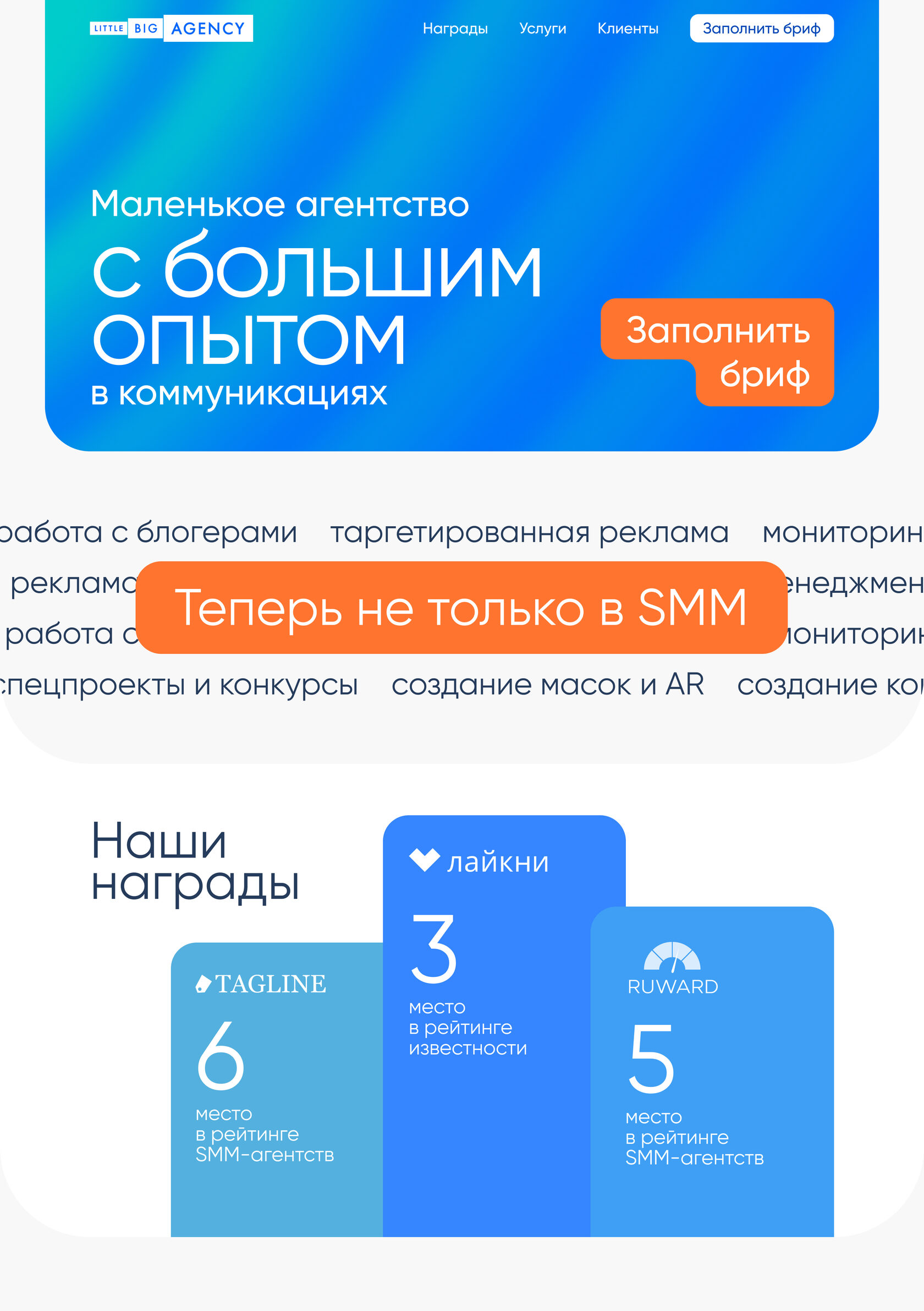


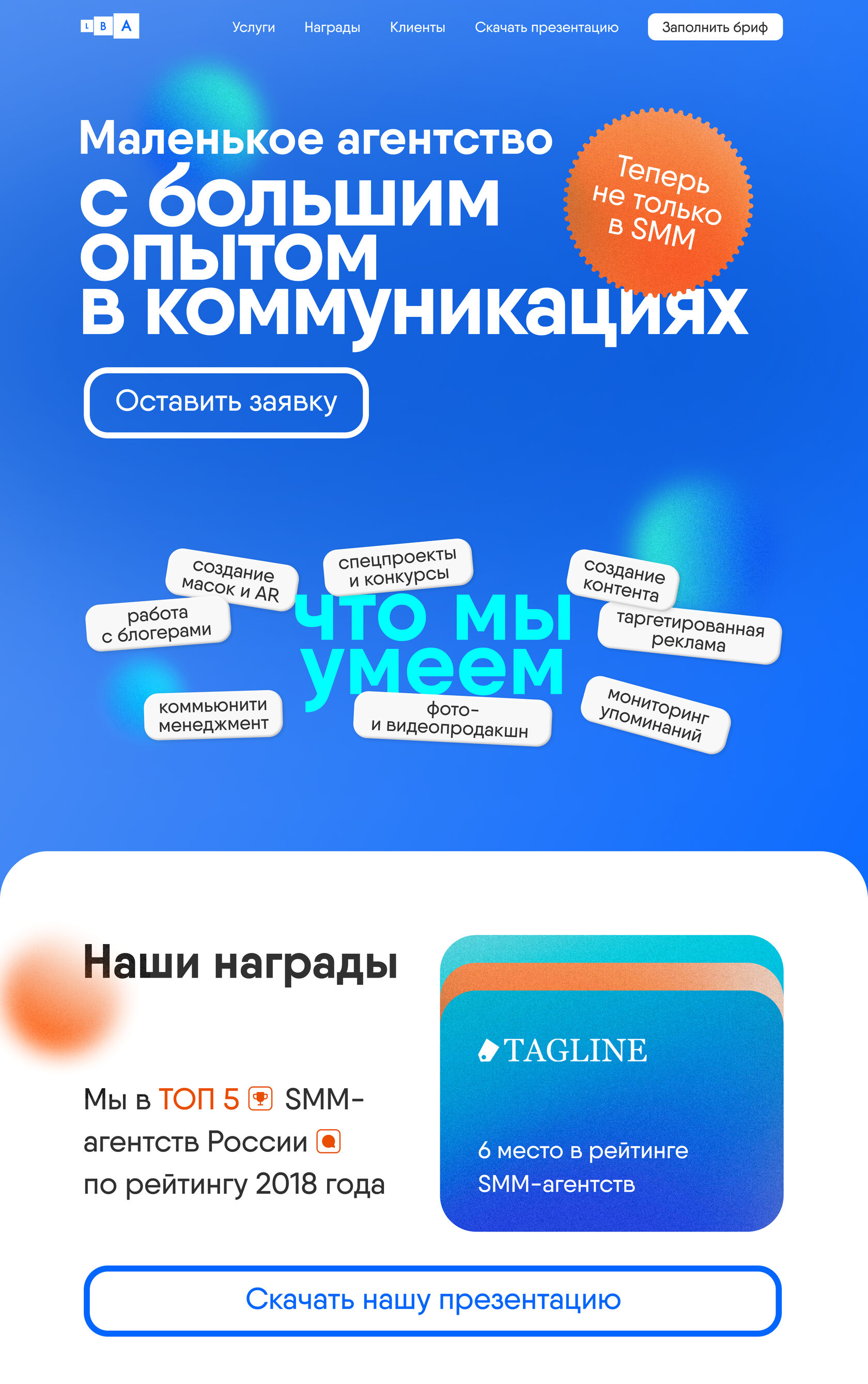
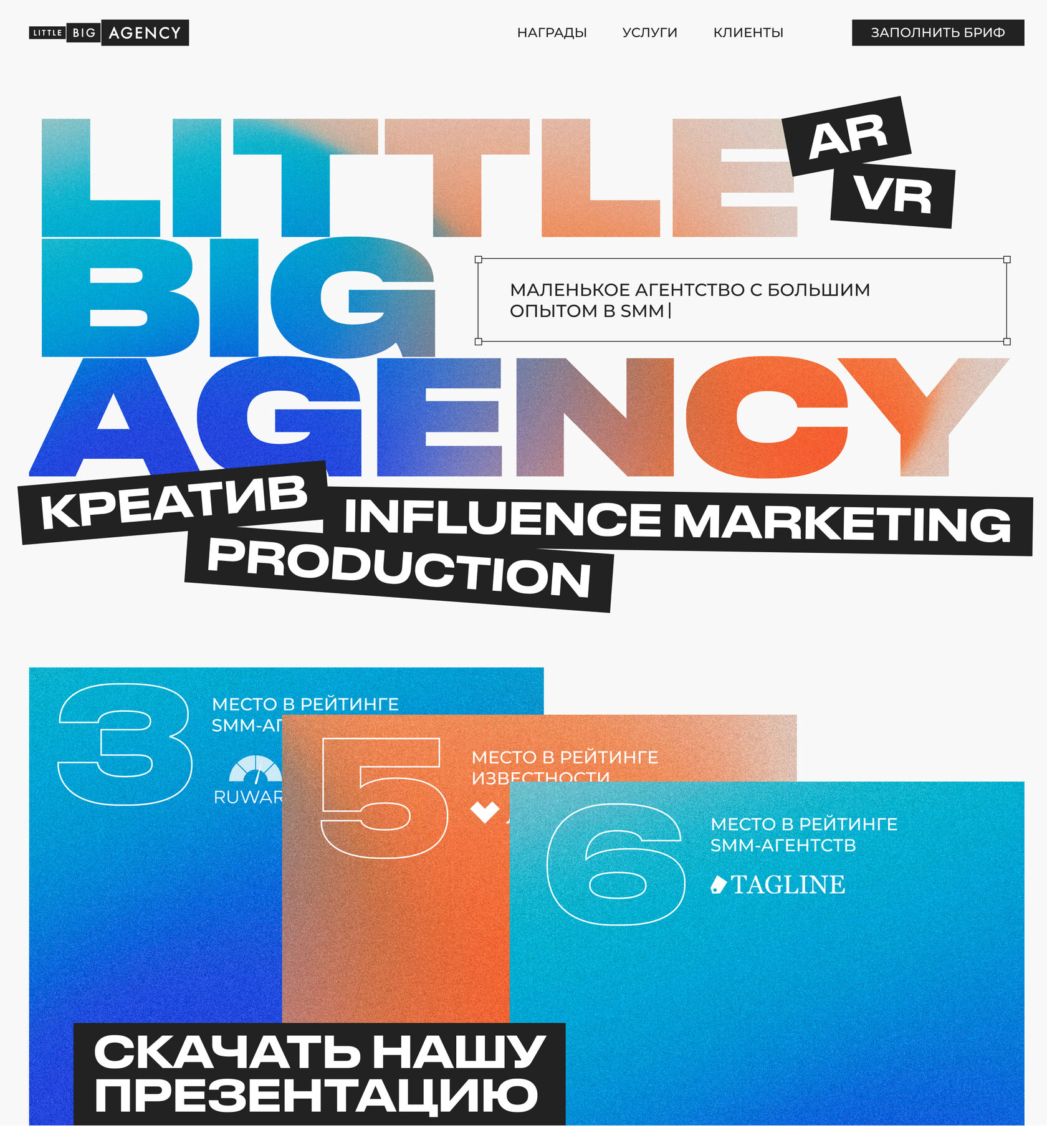
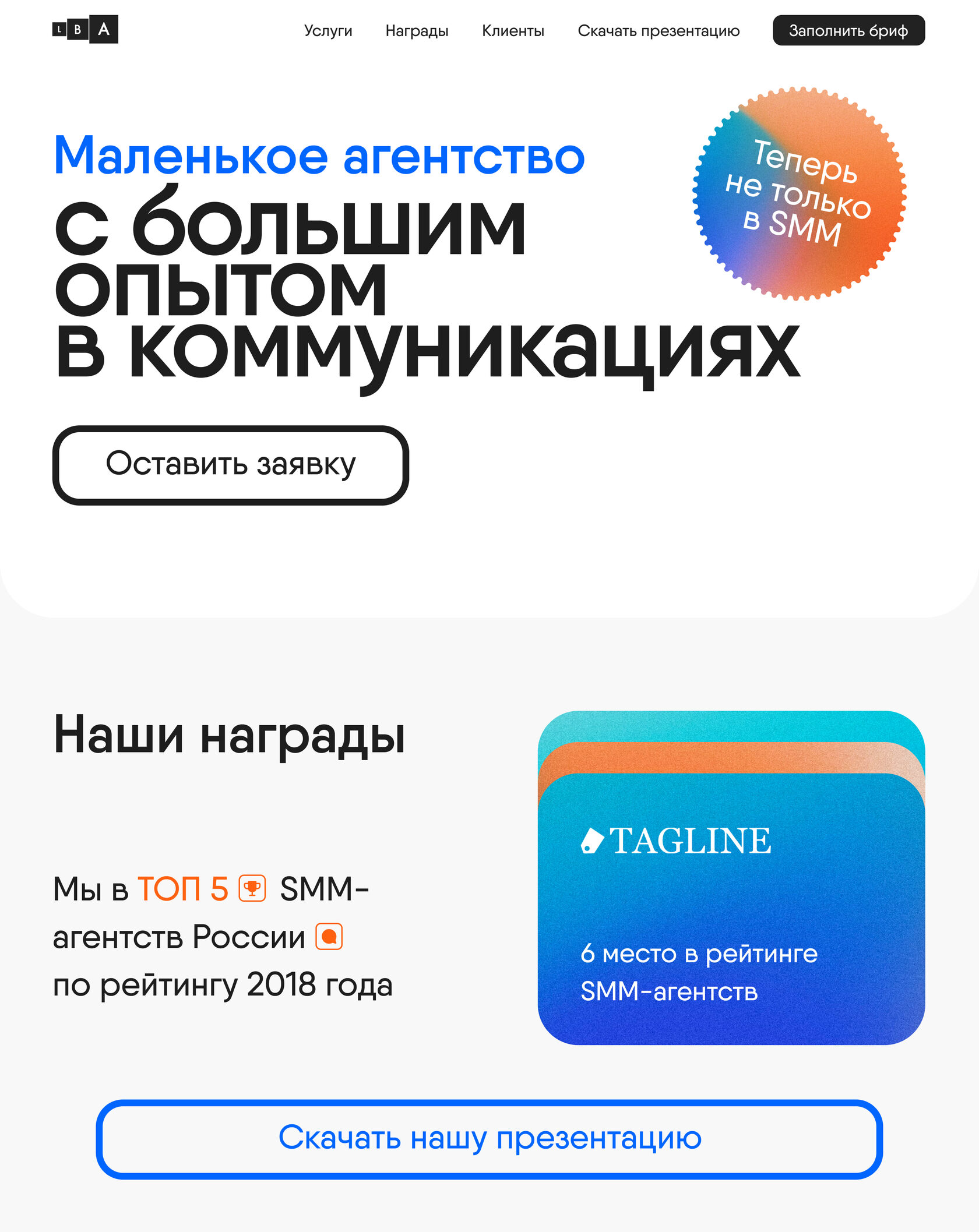
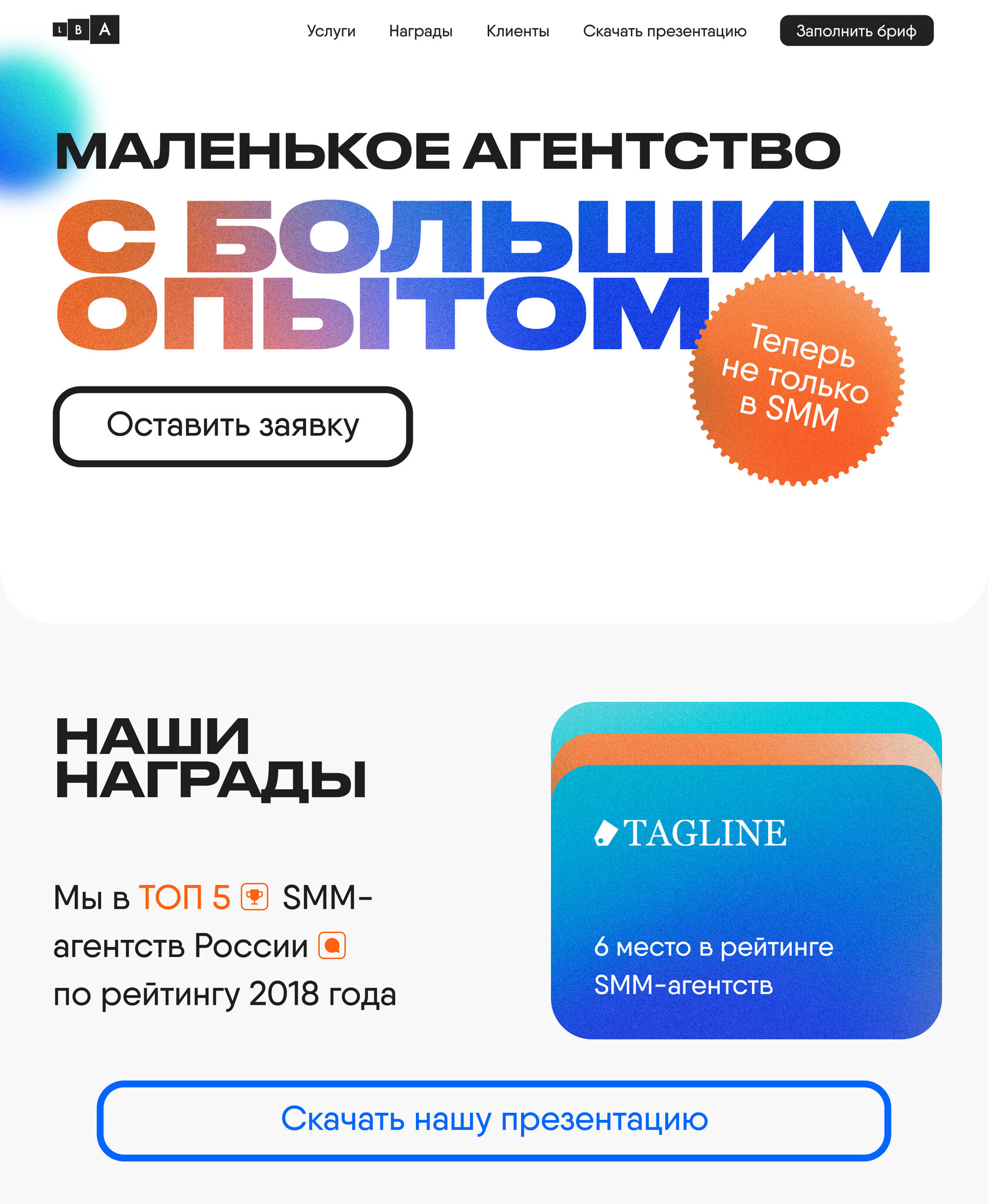
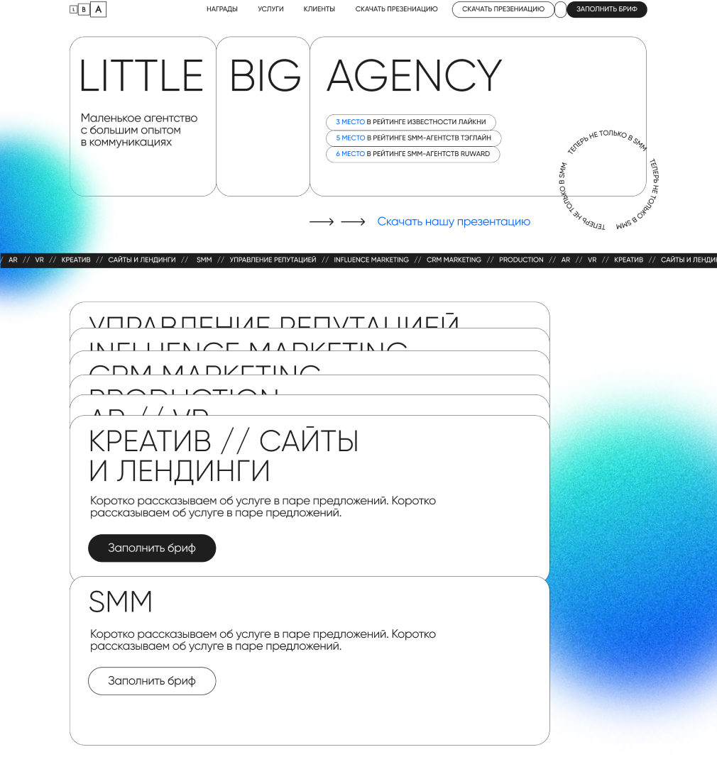
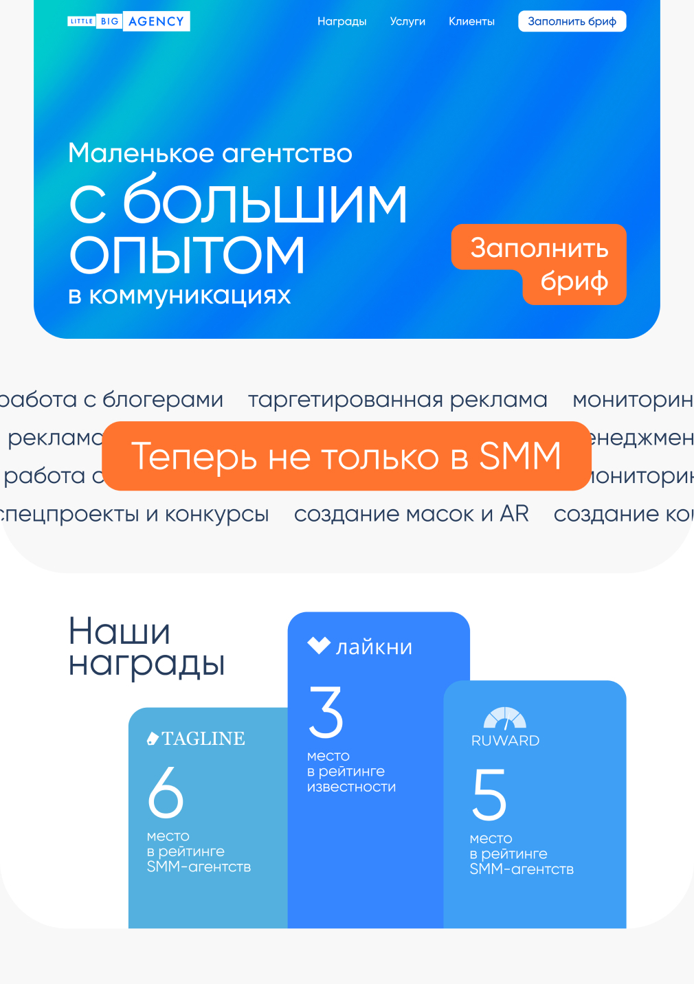

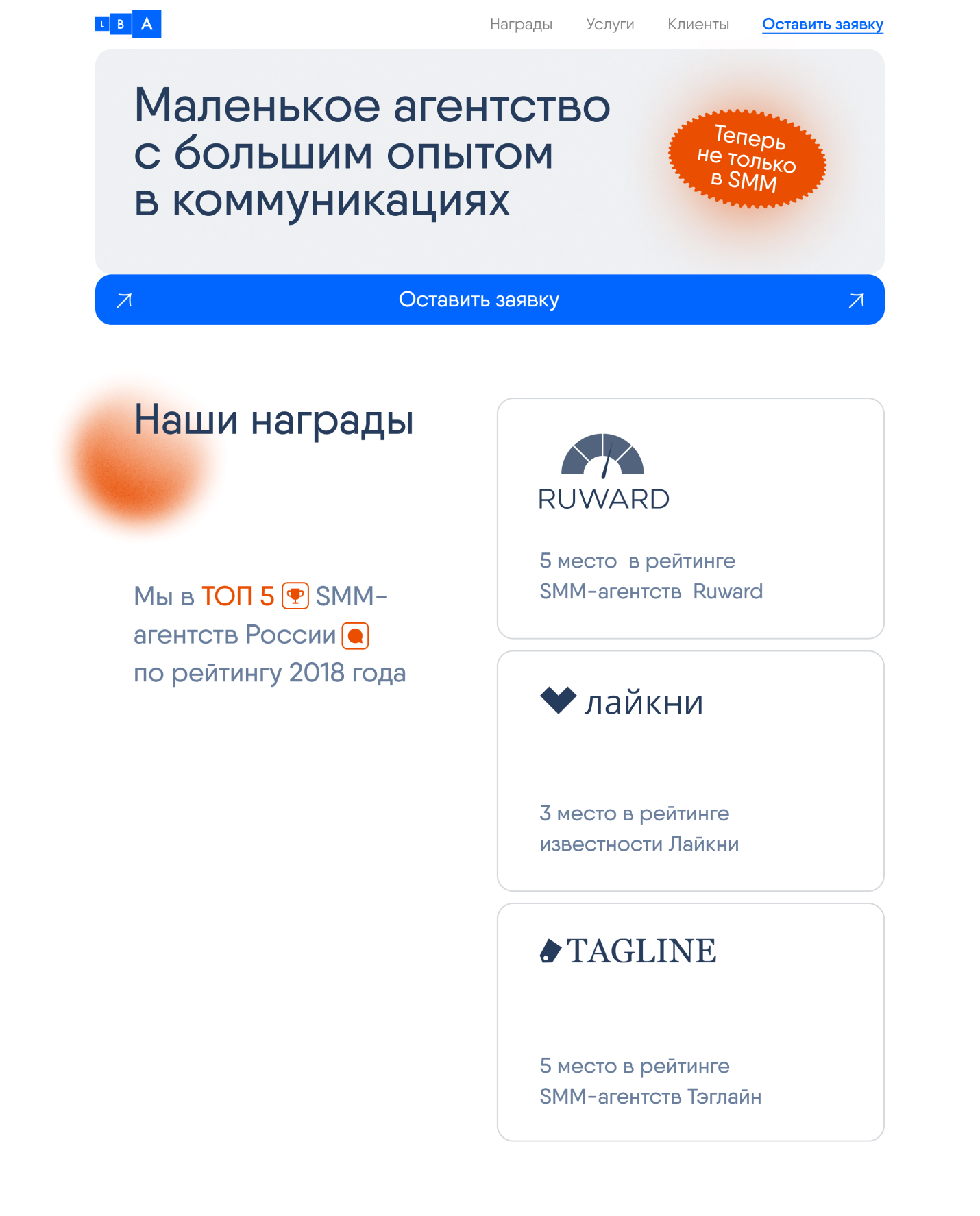
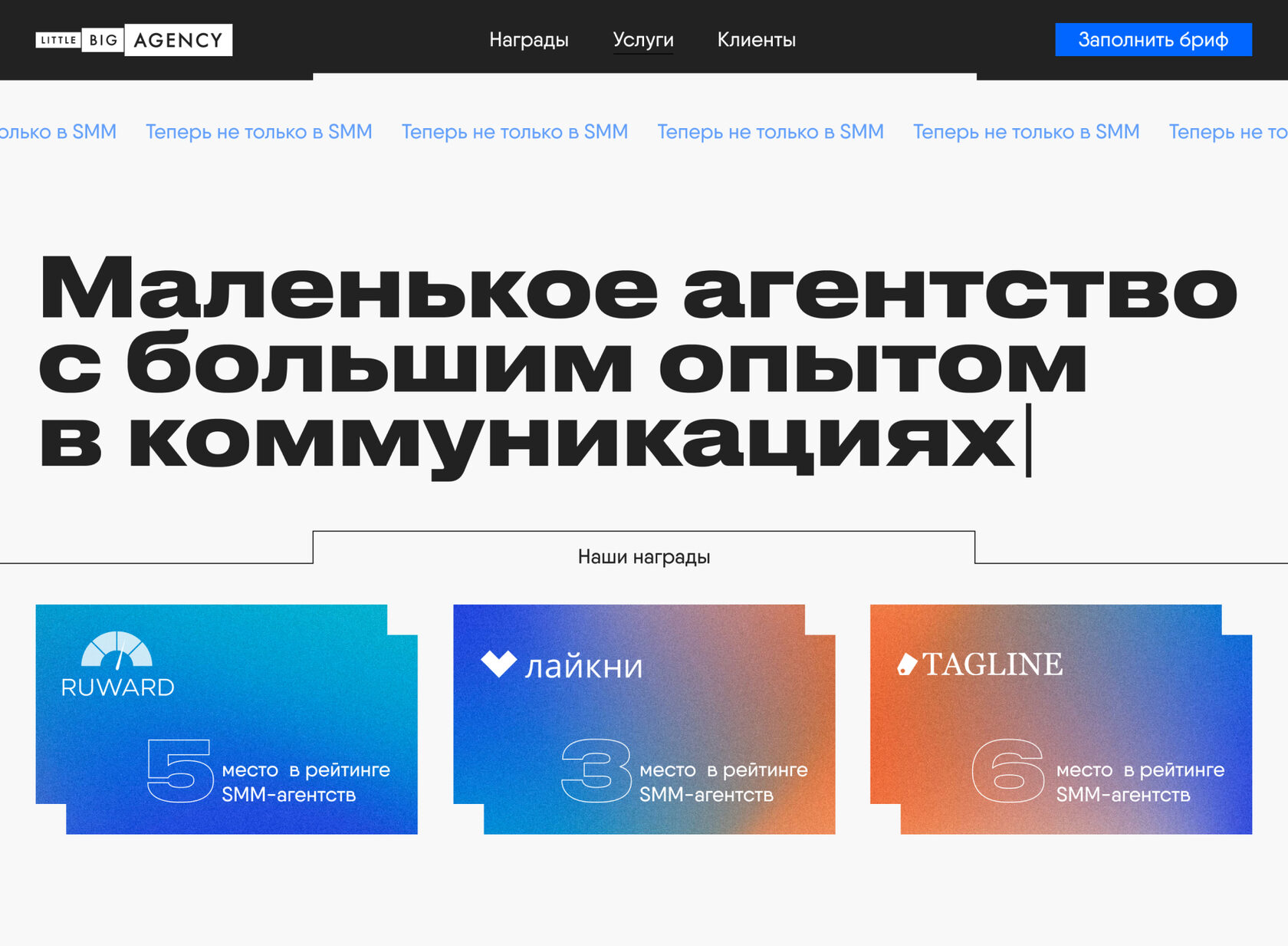
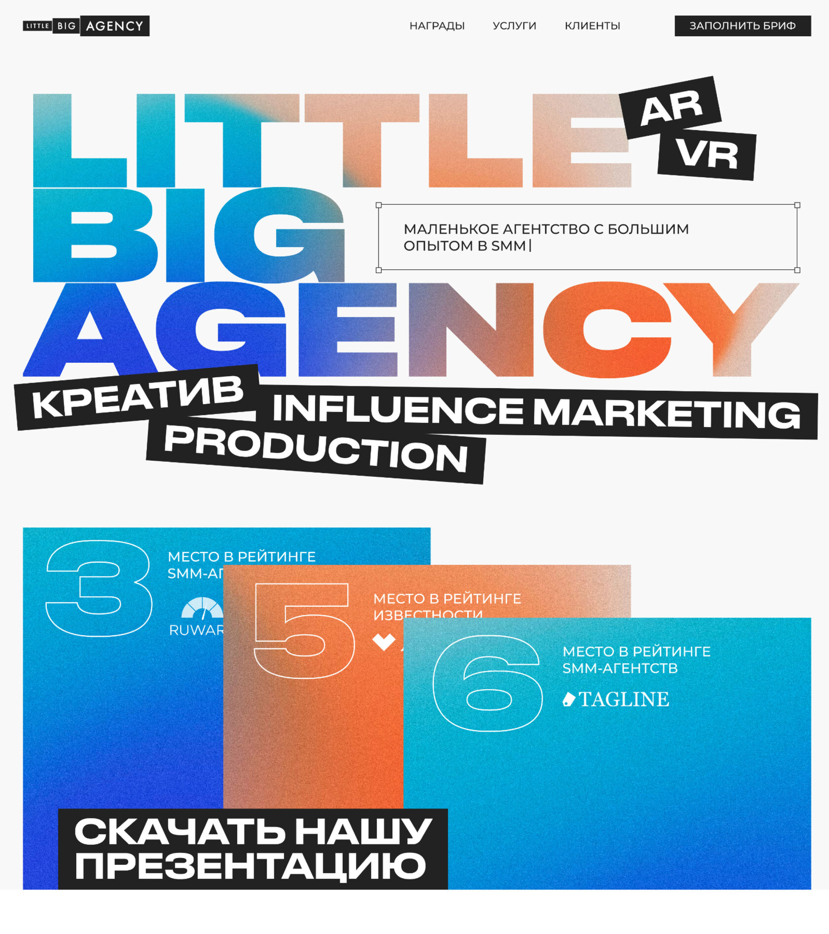
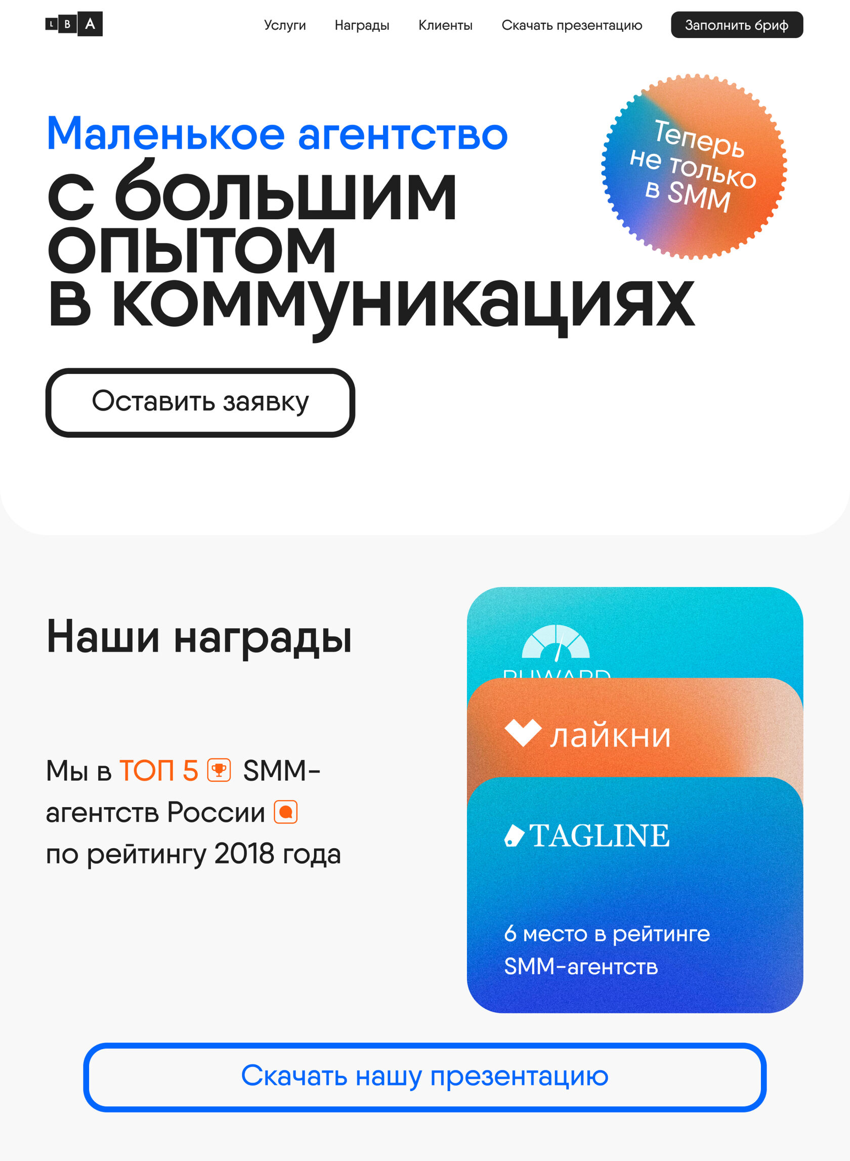
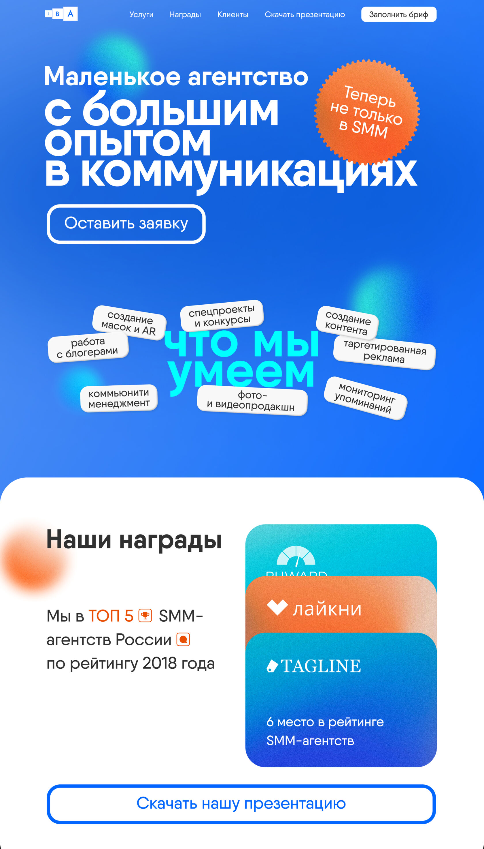


Other blocks
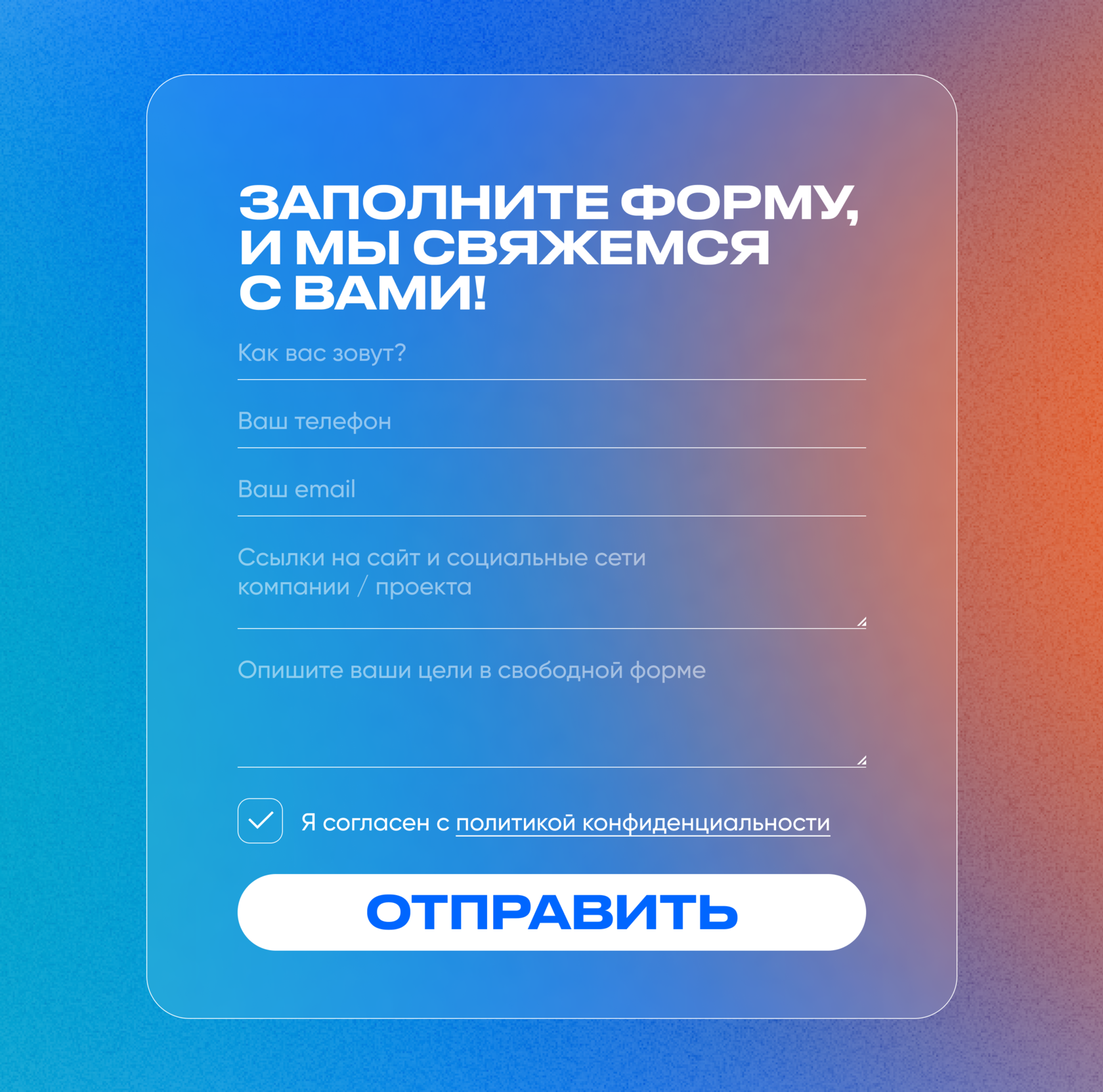
Then we took up the creative of individual blocks—we developed many different templates that can be used in any incomprehensible situation. Or understandable. No matter.
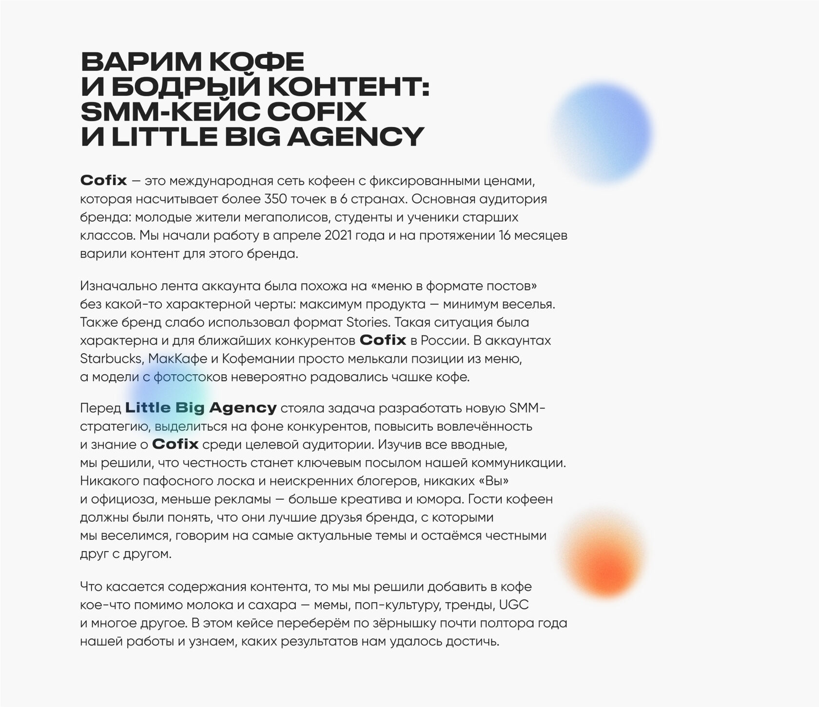
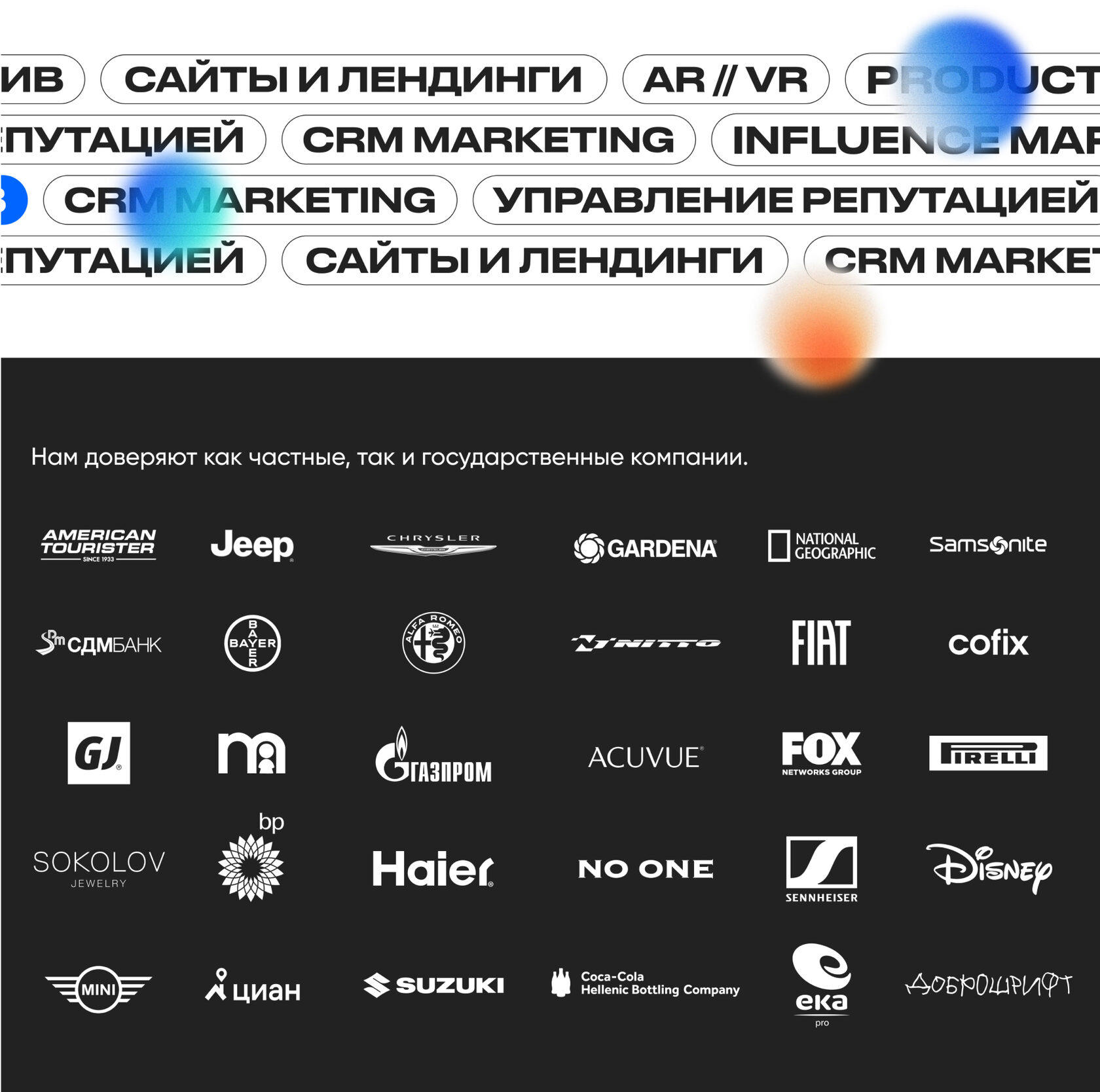
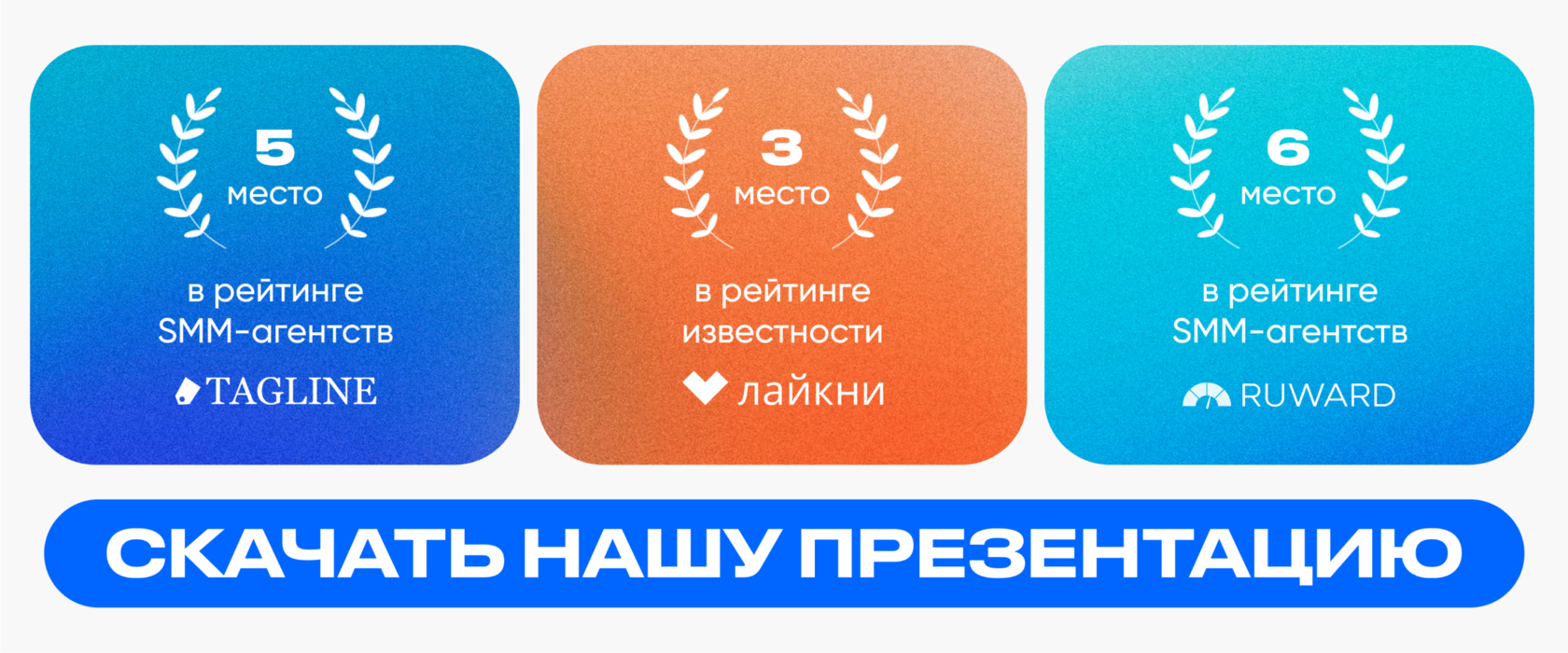
Typography
The font we have chosen is massive, confident, heavy. Thus, we wanted to play against the "little" name of the agency.

Main font

Font style

Color palette
We used the brand palette. It is dominated by a bright blue color, and we used other colors to create visual effects.


What is the result?
The result is a creative, bright and interesting landing page. Short but cool: with animation, style and useful functionality.

Of course, all blocks adapt to all types of devices. All in beauty. Hehe.


Adaptive

Cool idea, huh?


