Old design
The previous version of the email design no longer matches the style and spirit of the brand. The mailings were more gentle and minimalist than bold and bright. We wanted to make them catchy and, in a sense, challenge.

References
Result
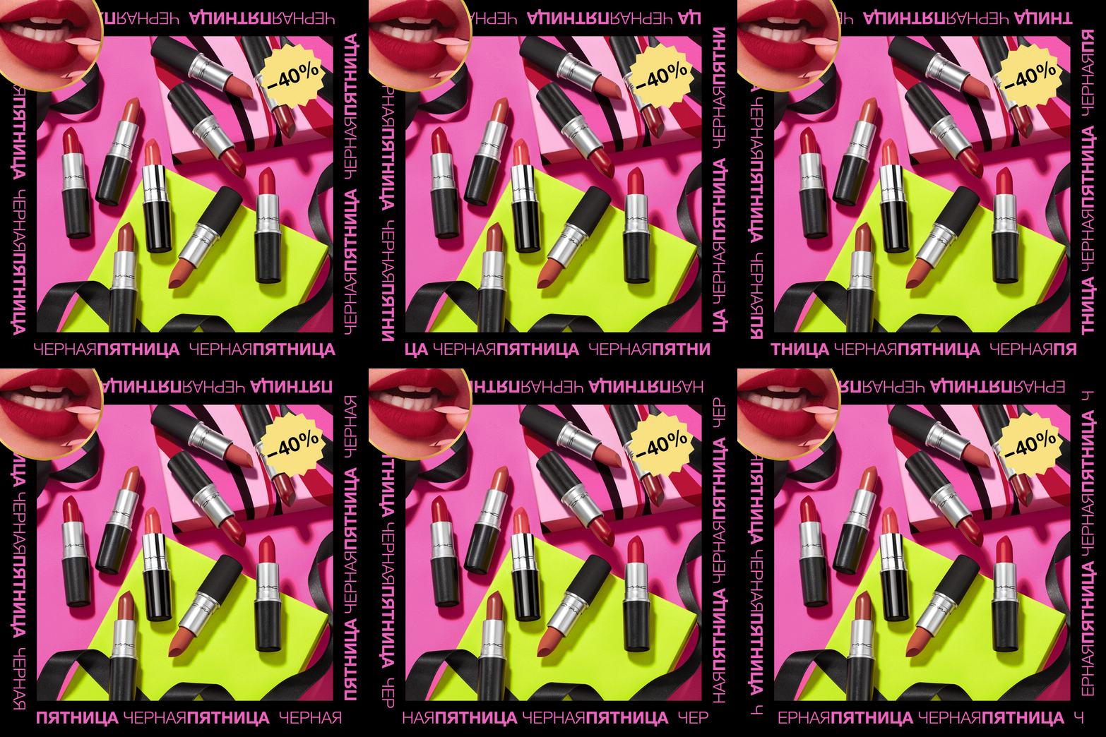
We made the design more provocative — in the good sense of the word and in the style of the brand. They began to use flashy neon colors, a lot of images of models and makeup. After such emails you will want to make up!


Adaptive
All blocks adapt to mobile devices, while maintaining readability and concept.

How about a design challenge?
