Mailfit Marketing — a landing page about special projects. Design and layout
Task: to increase the number of orders
First of all, we collected references with a monochrome background and accent elements. Why monochrome? You’ll find out later.
Process


Typography
Here we supported the brand with its standard font. It is easy to read and is great for headlines, which, basically, made up the whole landing page.

Primary Font

Inscription


Color palette
It also corresponds to the brand. Blue is the main color of Mailfit, so we used it as the main color of the landing page. The typography was done in white and black. Lime helped us emphasize important semantic elements of the landing page.


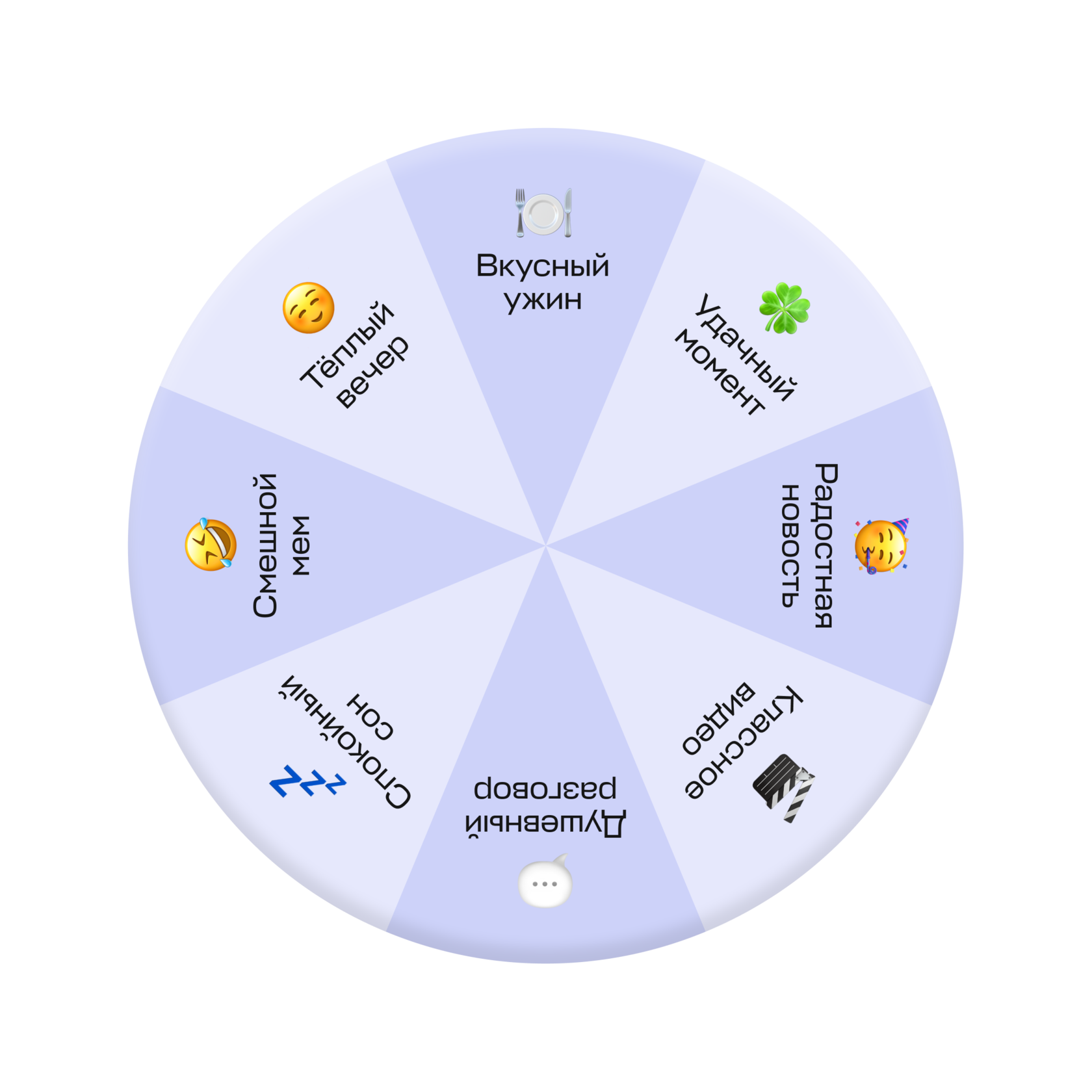
Wheel of Fortune
A frequent element in emails with gamification. We implemented the wheel to the landing page and made it interactive. When clicked, it spins and shows different answers. It’s real, no cap!
Gamification elements

Крутаните колесо фортуны, чтобы узнать, что вам подготовила сегодня судьба.
О, повезло, повезло! А ещё больше вам может повезти, если закажете спецпроект с нами.
Крутим
Заказать проект
Push the button
Bright, big, working — it’s all about her. A user can really push the button and get feedback from it. By the third click, a pop-up form appears. So it turned out to be both engaging and useful.

Gamification Cards
The cards we used are the agency’s real capabilities. We used them to immediately demonstrate to potential clients what they can get in their special projects.


Завидуем тому, сколько у вас свободного времени
The result
A tenacious, engaging landing page with unexpected plot twists, which is pleasant to play even for those who are far from special projects.


Adaptive
Of course, all blocks adapt to all types of devices. All in beauty. Hehe.
Let’s play, maybe?


