Red Sharks Ventures. Design and Layout
Task: creating of a website for a global investment company




Structure

First, we designed the main page of the site, and then we created pages for every company's product, which explain in detail how each of them works.
First References
The first visual references were provided by the client himself. The compnay needed something that complements the content without detracting from its essence.
First Design
We started working on the design and made it visually easier. But we realized soon that we still need something more unique.
New References
Soon we realized that our client needed something more serious. No stock photos, no gaming images.
Illustrations
Simple, but unique illustrations do not draw attention to themselves and allow users to focus on reading.

Typography
The main font is Space Grotesk, which is technological and trendy, but at the same time simple enough so that it won’t become outdated in a year. We use another font in text blocks to make it easy to read.
Primary Font
Minor font


Inscription
Inscription


Color palette
What is the result?
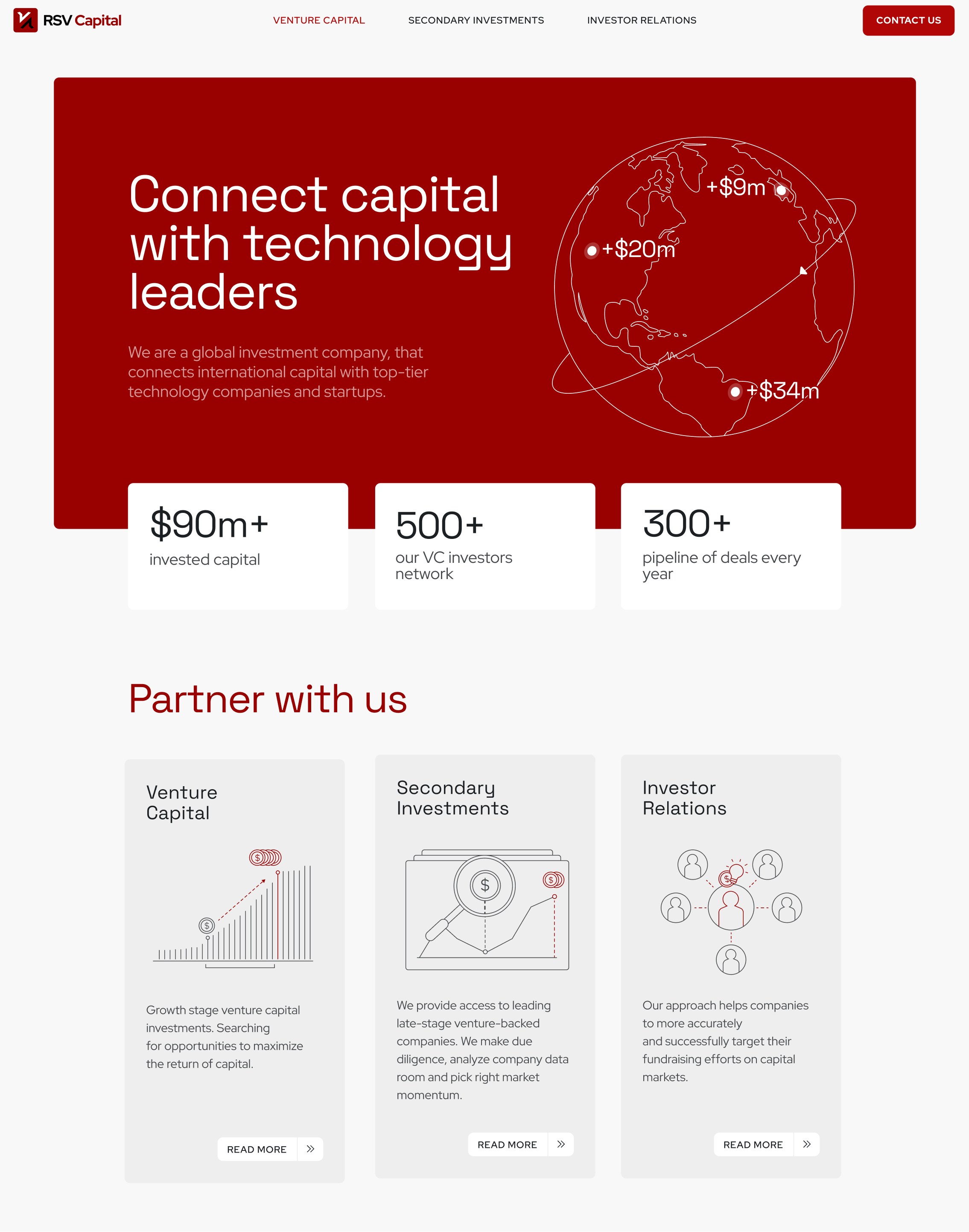
We made the site look lighter and more modern. The clean and concise elements give the feeling that we are facing a strong player in the global market.

Adaptive
Of course, all blocks adapt to all types of devices. All in beauty. Hehe.

Cool, right?


