


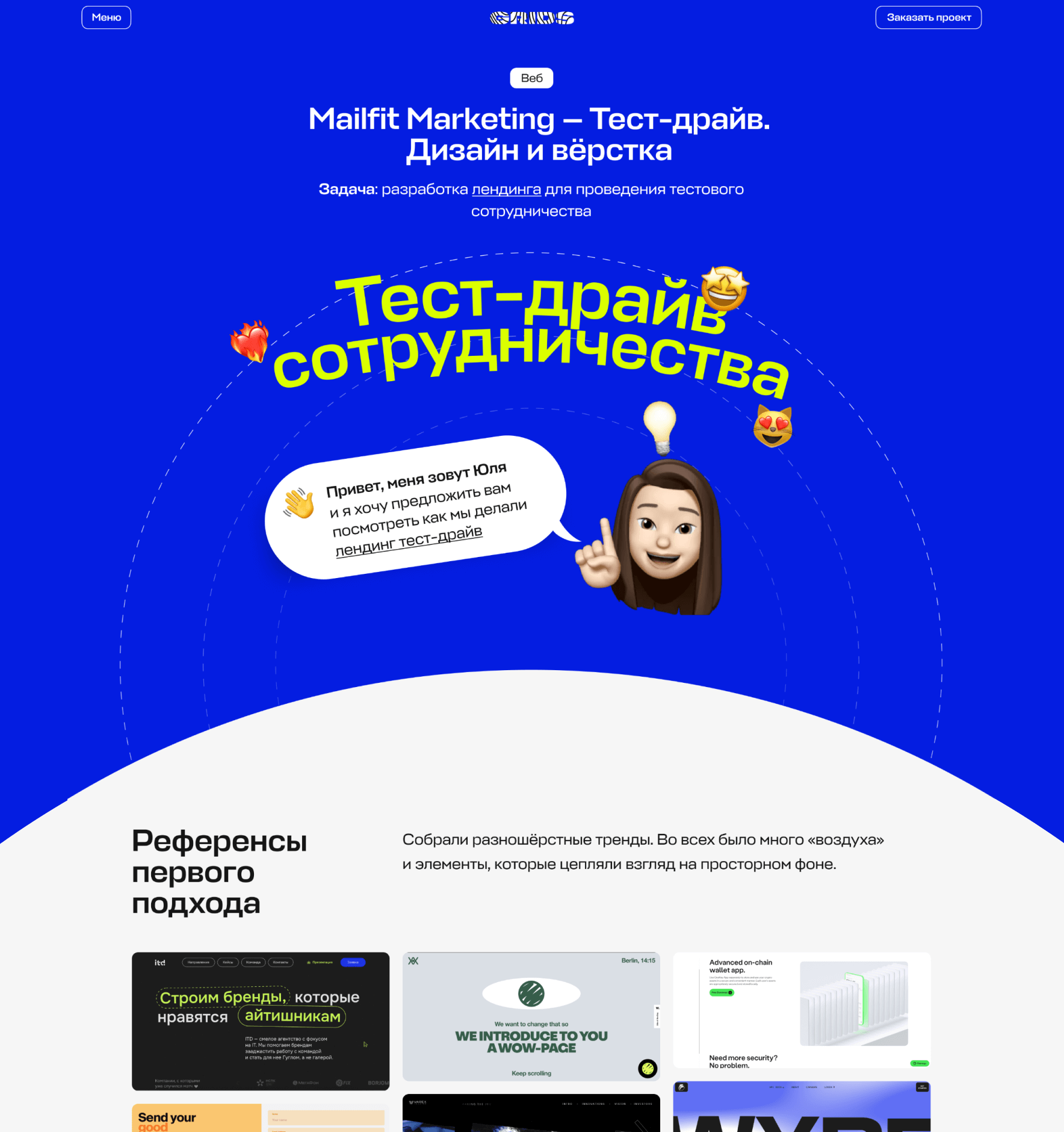
Hi, my name is Julia
and I'd like to offer you a look at how we did the landing "Test-drive"


Mailfit Agency — Landing page "Test drive". Design and layout
Goal: to develop a landing page to attract new customers to a demo-period
The first approach: references
First of all, we collected motley trends. The main idea was to find something "airy" but with accent elements that would catch an eye on a spacious background.
The first approach: draft
It was the attempt to make a "Test drive" landing page as a logical extension of the main website of the brand: colors, fonts, composition — all of them matched the brand image.
The second approach: references
Here we leaned towards a more futuristic style to emphasize the "digitality" of the brand.
The second approach: draft and final variant
Puf-f-f! We made a 180-degree turn from the first draft and made a totally new one — the whole concept was completely redesigned. So the landing page became not just an extension of the main website, but a separate space with its own style and rules.
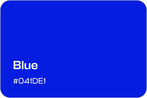
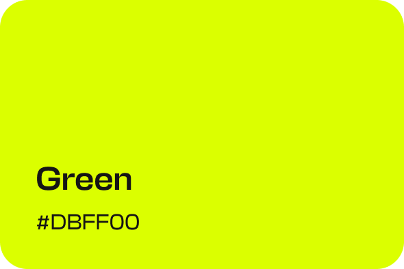
Color palette
Main colors still supported the brand image, but we added a bright green color to emphasize important elements and messages.


Fonts
We used the Mailfit branded font in all blocks and buttons.
Main font
Stapel
Regular
Font style
Medium
A
a
Emoji
To make the landing page more personal, we used our client’s real memojis. So we managed to create the effect of a personal appeal and make the page more lively.
Result
Airy, bright, creative. The landing page is nice to look at, and the non-standard approach to structures and headings catches an eye and makes a user scroll further.

Adaptive
Lorem ipsum dolor sit amet, consectetur adipiscing elit. Mattis a, accumsan vitae lacinia eu diam porttitor mollis urna. Elementum ultricies non viverra dolor facilisis justo.
Nice?


