TopDelivery. Landing development
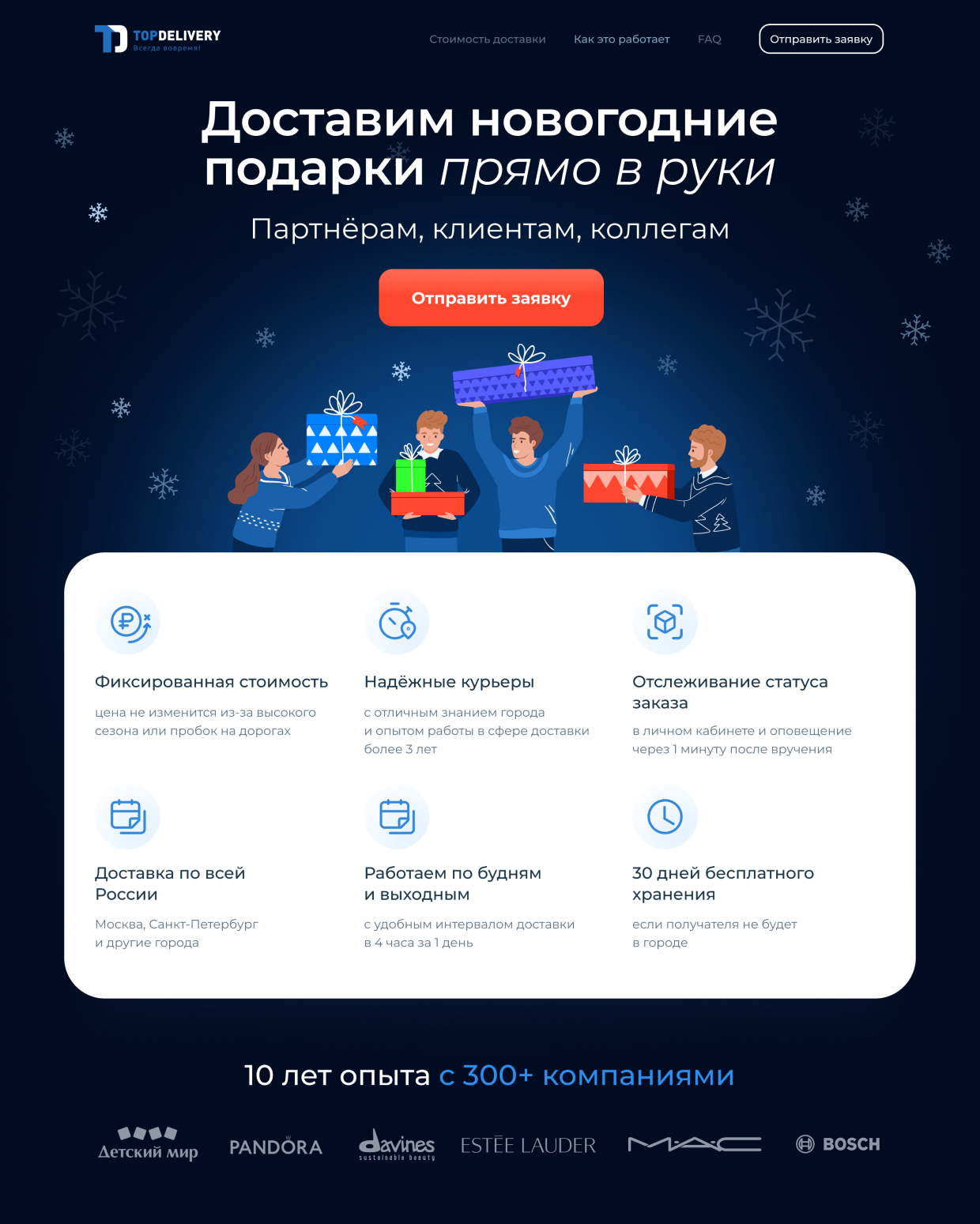
Task: development of a landing page for the delivery service «Top Delivery»


Process of creation
We thought out several variants of prototips and choose the most modern, light and creative. We immediately provided for possible functionality: animation and other blocks.
Separate blocks
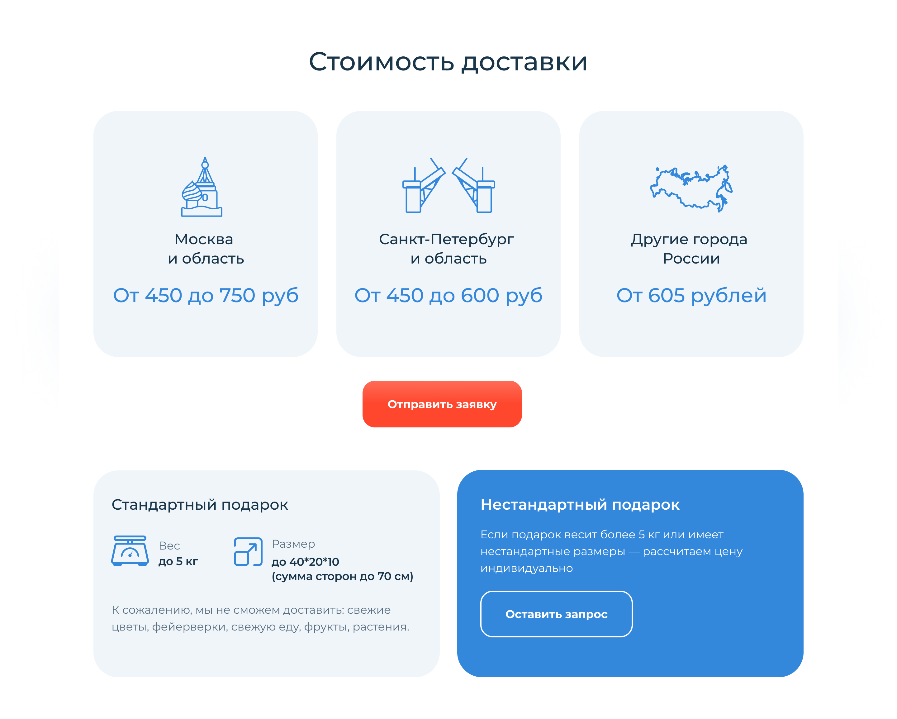
We maked in the same style lists, a subscription form, cards and other elements of the landing page.


FONT THICKNESS

FONT

Typography
Color palette


Branded icons
We created the icons pack in the same style for to display various elements.


Adaptive
We maded the landing page on Tilda. A lot of users scroll sites from mobile devices. We took this into account and thought how the blocks should adapt in the mobile version.


