



Yoola. Identity
Goal: design an identity for media company of expert solutions for influencers and brands.

The basis of the concept is that circles are used in the logo like a wheel and a peg-top that give movement. These chord with lines symbolizing a business side and a steady rise.
Logo idea






Full logo
The capsule version looks like a letter Y on the quadrate with rounded corners. This is like a wheel and lines too.



Color palette
The basic violet for accent titles, icons and selections.
Black for the background, texts, icons and separation lines.
The accent colors (blue, yellow and orange) like alternative of violet and for graphic materials.
White for texts, icons and separation lines.
Typography
We picked up a font that chords with the logo and classic and topical at the same time. Due to it’s simplicity, the font will remain trendy for a long time.

Corporate colors of each unit
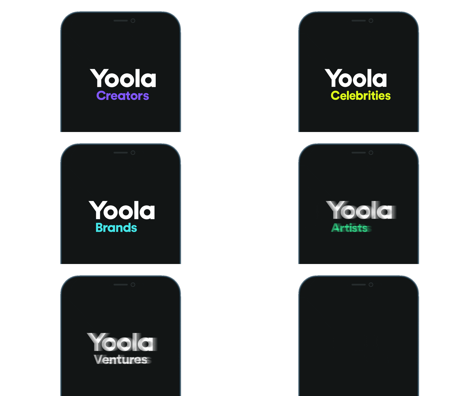
Yoola is multibrand which includes Yoola Creators, Yoola Brands, Yoola Celebrites, Yoola Artists and Yoola Ventures. Each unit responsible for separate direction of work. We created the color logo for each of these.


Patterns
We formed several types of the geometric patterns. These symbolize waves of sound or media broadcast and supplemented with stars.




Icons
We formed an design of banners for social media like brands tone of voice: it’s human, bright and clear.
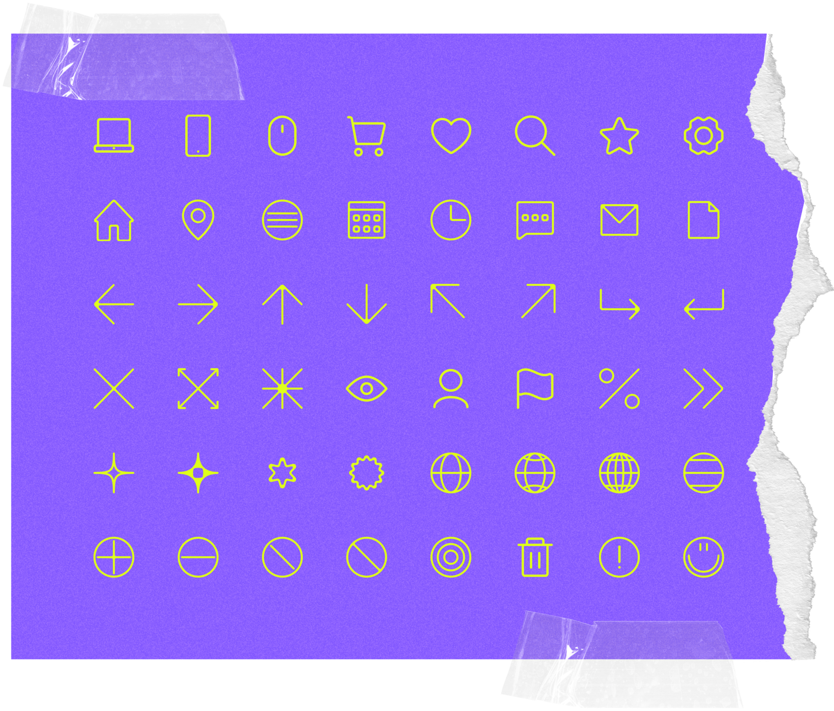
We created the icons pack in the same style for to display various elements.
Social media

