


How to Make a Product. Design and Layout
Task: creating of a landing page for a training by Van Zamesin

Process of creation
First References
We needed something as catchy as possible, but at the same time minimalistic enough not to distract a viewer from the content. We made a usual landing page about business at first.
First Teasers
We made the design of four teasers in a strict style, taking our references into account. We used two different fonts.
New References
Soon we realized that our client needed something less serious and trivial. We found creative and unusual design references that match his style.
New Teasers
We combined several ideas from different references and got the desired design.
Illustrations
We started working with illustrations from references also. We wanted illustrations to reflect the style and spirit of the landing page. We searched for monochrome elements and graphics, no stock images and popular characters. When the customer found an illustrator, we described our ideas in detail to him.
Author: Illustrator
Typography
We used the font pair Gilroy and Angelica Pro Display — the second font emphasizes the main part of the headings.

Primary Font
Minor font


Inscription
Inscription


Color palette


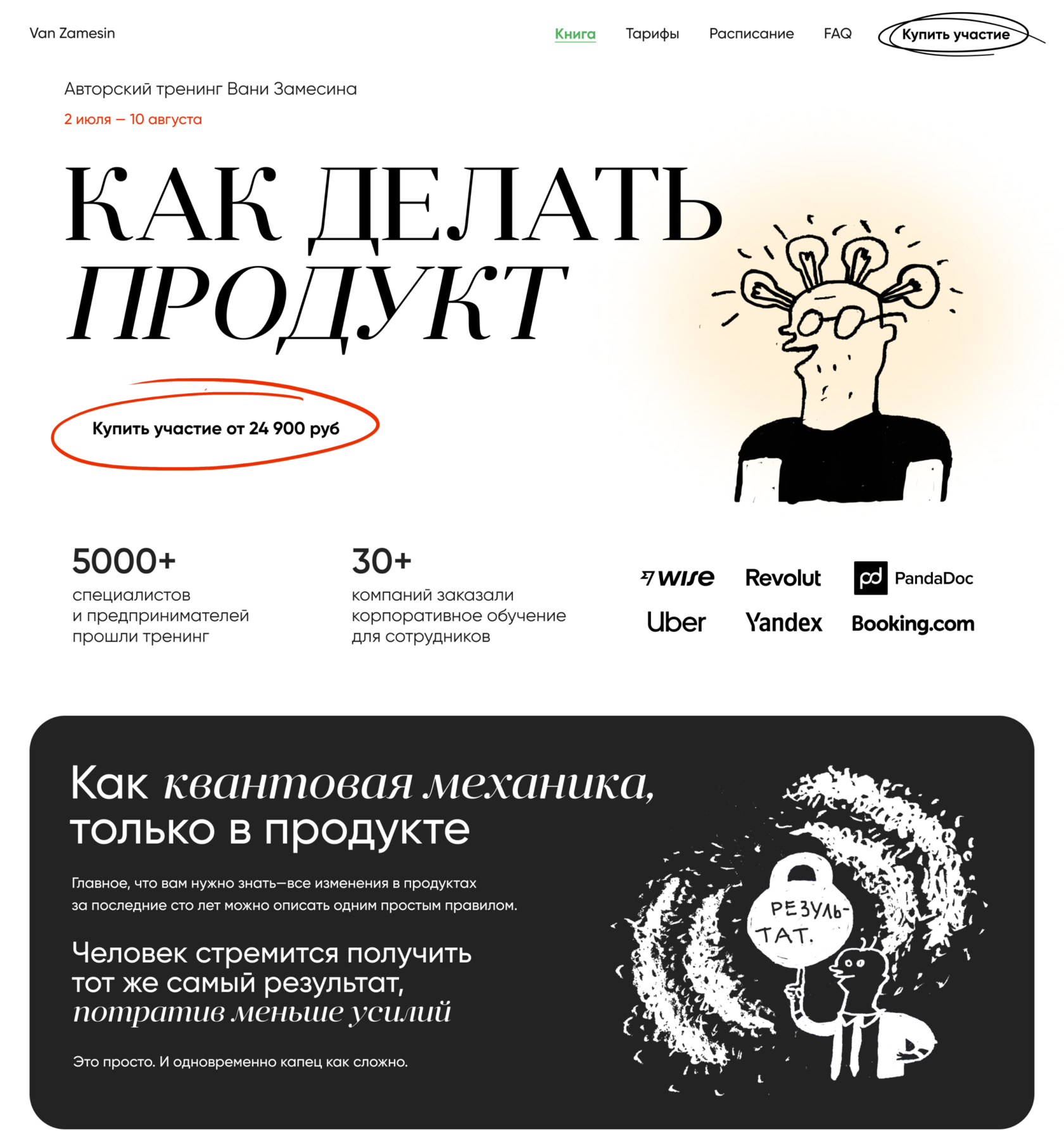
What is the result?
A captivating landing page that looks like a longread — it is interesting to look and read it through.

Adaptive
Of course, all blocks adapt to all types of devices. All in beauty. Hehe.

Cool idea, huh?


