What emails come from Yandex
Design

Elena Shumnaya
Discussion emails from the main Russian IT company
Too lazy to cook? Order Yandex.Food or Yandex.Lavka. Don’t feel like driving? Call Yandex.Taxi and turn up Yandex.Music louder. Don’t know what to do? Look for an interesting location in Yandex.Maps, check out Yandex.Afisha, or go explore new cities with Yandex.Travel. And don’t forget to dress for the weather—Yandex.Weather to the rescue.
Every day, millions of Runet users turn not only to the main Russian search engine, but also to numerous services of an IT company. And each of them, of course, has their own emails—let's see how Yandex communicates with its subscribers.
Let’s start with a subscription, thanks to which Yandex users receive cashback, watch movies and listen to music for free.
Meet Plus Multi!

The welcome email tells about the three main subscription features: movies on KinoPoisk, Yandex.Music, and cashback—everything is short and to the point.
That’s just on the first screen is clearly not enough image. This is the first email: it is clear that all the goodies are written in the text, but it would be better to reinforce the email with a visual story so that at a glance it is clear what the email is about.
Minimalistic email design: everything is structured and divided into understandable blocks. Bright buttons are clearly visible on a white background and call for action—the reader immediately understands what to do. Plus sign in Yandex.Plus karma.
What to do on vacation

Yandex.Plus rarely sends emails to readers, and if it does, it’s on business. Here, the service reminds of itself before the long New Year holidays: the email tells about the available entertainment and is almost the same as the welcome email in terms of content. But there is also something new: a bright banner on the first screen, illustrations stylized for it in each block, and gamification calling for collecting a traditional salad for the New Year and winning gifts.

Spring with the right purchases
We continue the hit parade of Yandex emails with a no less popular service—Yandex.Market.
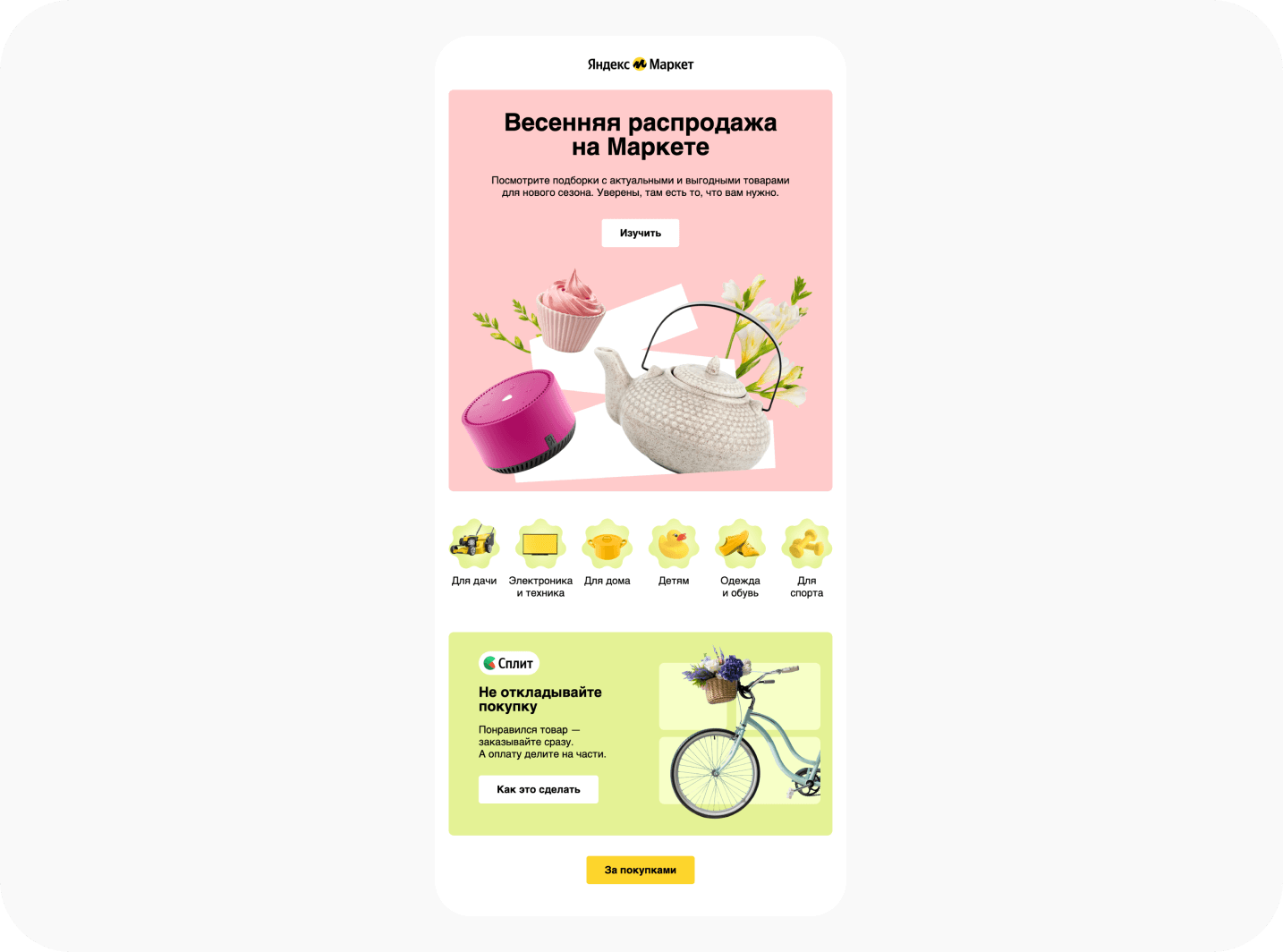
The spring promo email greets readers with a floral banner, which immediately makes it clear what the letter is about — of course, about discounts.
It’s great that there is navigation between sections: you can immediately find what your soul asks for. But the product selection with the display of prices "before" and "after"—so that the reader could clearly see the benefits—was not enough. The additional block with the Yandex.Split banner is very much on topic: it looks spring-fresh.
Different looks and styles in one email

The first screen directly says: "Sometimes we don’t even know how many different products we have." Apparently, this is why almost all emails of the service have a convenient breakdown into sections.
When you open an email with such a subject, you expect to see wow looks and then a selection of products for these looks. But there is no specifics here: the block "Everything that is now profitable", for example, does not say anything other than the presence of discounts [and it’s not clear for what]. Although the email is visually pleasing and minimalistic, it does not differ in its usefulness.
But back to the design: in the "Everything from well-known brands" block, colored logos are difficult to read on yellow plates. It would be better to make the entire block yellow, [like the other blocks below], and make the logo tiles white.
I want to visually highlight all the headers, make them larger and combine them with blocks—this way the email will look more solid. It would also be worth working with the rounding of images inside the block so that there is one style everywhere. And so that all roundings are the same—now they are different in diameter.
Discount 500 rubles on the Market
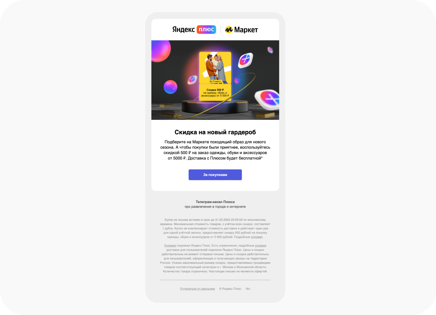
And here we see an example of a cross-marketing email—a kind of collaboration between two services: a coupon from Yandex.Plus for a discount in Yandex.Market. It’s just that guys promote other products and services because they can.
A coupon in the truest sense of the word—it is made exactly in the style of a coupon [which is cool] and catches the eye with a bright yellow spot on the first screen. All the conditions of the promotion are detailed in the text, and nothing more.
Discounts from restaurants
Yandex.Food saved everyone not only during the pandemic—it seems that every average family uses this service at least once a month.

See the email header? We also lost it. It seems that someone still screwed up with the layout.
Otherwise, it has everything you need for a food delivery mailing list: mouth-watering photos of pancakes, burgers and shawarma, banners for each section and the word "discounts" on a red background. Minimalism inherent in Yandex is good, but the email lacks air [besides the header]. Headings also want to visually increase.
What do we do so that everyone can learn
Now for the big email. This time from Yandex.Practice:

This content email is notable for its usefulness. Although there is a lot of text, it is easily perceived thanks to the air, graphics and visual illustrations. You can also immediately notice that the emails of this service are distinguished by buttons that stretch almost the entire width of the screen [apparently so that the reader does not miss for sure].
It’s cool that they talk about people and careers, as well as teaching methods and technologies. It turned out almost a longread, but broken into convenient readable blocks, so that the information is better absorbed.
It’s good that the entire email is made in the same color scheme — white, blue, blue. It is interesting that each email of the Workshop differs from the previous color concept.
Invitation to the webinar "Target or SMM"

A cute black-on-pink banner says: webinar. And thanks to him, subscribers immediately understand what and when they will broadcast. An interesting move is to place an illustration below the button so that nothing distracts from the main message.
Then everything is on the case: what, who and for whom. The wide button at the end of the email, characteristic of the Practicum, repeats the color of the banner, maintaining a single color concept.
Make your profile stand out from others
And this email is from Yandex.Services, where everyone can find a job or an employee: the service helps to contact potential customers.

You will not see any colorful banners here — this short email gives a couple of useful tips, thus advertising your promotion channel. Neat and concise.
Concerts you’ll love
There were times when we often went to concerts. And then many used Yandex.Afisha …

This digest of upcoming events is a standard story for this service. Afisha’s emails are distinguished by a black background and the number of celebrities on the banners, but subscribers do not even read carefully, whose concerts can be heard in the coming month.
By the way, the same text goes from digest to digest, only the images on the banners change:

A survey appears in the Yandex.Afisha digest: readers are asked to share whether they liked the email. A classic for reactions in emails, but it could be more interesting.
✍️ You didn’t pick up tickets for the movie "Tom and Jerry"

Another email from Afisha, but this time a trigger one. The "Abandoned Cart" mechanic often helps to return the subscriber to purchase, but here the call to action was not enough in the email text. But it is in the buttons, but there is some kind of trouble with them—apparently they are broken.
There are new arrivals: Bi-2, Antonio Vivaldi, Louis Armstrong

Music service recommendations email: based on your preferences, Yandex.Music offers you to listen to new tracks from your favorite artists. This is how loyalty is formed.
The email looks interesting — like a playlist in the service itself—immediately a match. It is not clear what happened to the button again — probably there is a jamb in the layout. And if there was an "Add to playlist" button at the end, there would be no price for such an email.
Three things about Drive that are better to know than not to know

This email is received by Yandex.Drive users after subscribing. The first welcome email may seem gray and nondescript at first glance, but this is just a background—bright banners dilute the strictly sustained concept.
Here you can immediately pay attention to the special style of the header—it is tilted and imitates movement. The email tells about the main advantages of the Drive—tariffs and insurance. Don’t forget about Yandex.Music to remind readers of their other convenient service. But more brightly highlighted headings and buttons were not enough—it is not clear what the reader should do next after reading the email.
You can ride cheaper or even for free
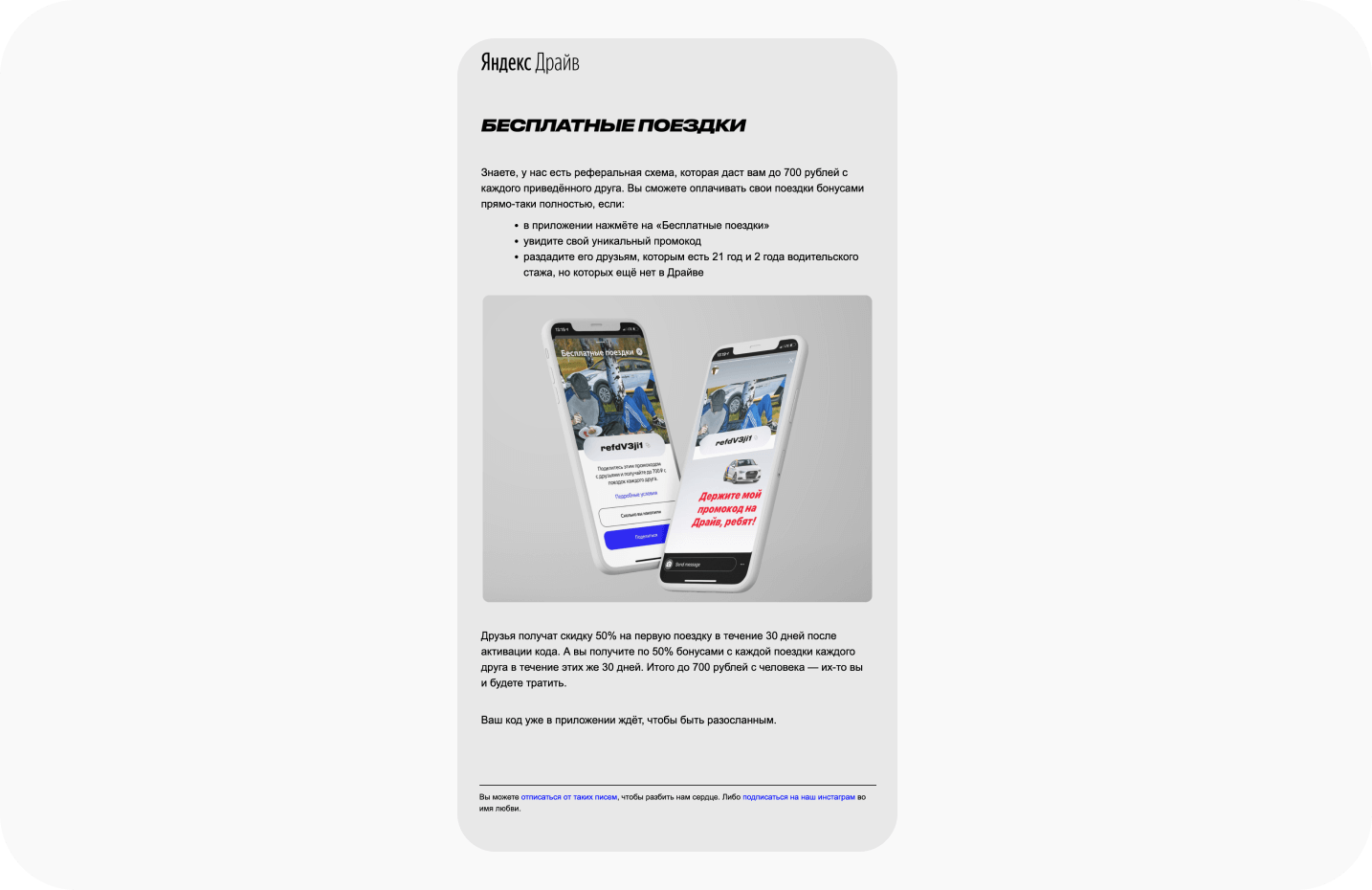
The second email of Drive’s welcome chain tells about the referral scheme—everyone can get a discount on carsharing by inviting friends. They did a great job with the banner—they visually showed the application right on the screens of smartphones. Again, simple and good, but again there are not enough buttons—at least for the application.
Despite the fact that all emails are small, Yandex manages to convey the essence to the reader and describe the benefits of the service without too much. Looking at 12 emails from different Yandex services, we can conclude that their creators adhere to a single design system in emails for all products—Market, Music or Drive. By the way, we also made a branded master template for Yandex.Business—you can view it here, and order the same one here.


